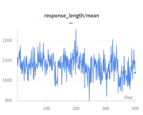
## Line Chart: response_length/mean
### Overview
The image is a line chart displaying the "response_length/mean" over a series of steps. The chart shows fluctuations in response length, with a general trend around an average value.
### Components/Axes
* **Title:** response_length/mean
* **X-axis:** Step, with markers at 0, 100, 200, 300, and 400.
* **Y-axis:** Values ranging from 900 to 1200, with markers at 900, 1000, 1100, and 1200.
* **Legend:** A blue line representing "response_length/mean". The legend is positioned directly below the title.
### Detailed Analysis
* **Data Series:** The blue line represents the "response_length/mean".
* **Trend:** The line fluctuates significantly throughout the steps.
* **Values:**
* At Step 0, the value is approximately 1075.
* At Step 100, the value fluctuates around 1075.
* At Step 200, there is a peak at approximately 1250.
* At Step 300, the value fluctuates around 1075.
* At Step 400, the value is approximately 1025.
### Key Observations
* The "response_length/mean" fluctuates between approximately 950 and 1250.
* There is a notable spike around Step 200.
* The final value at Step 400 is lower than the initial value at Step 0.
### Interpretation
The chart illustrates the variability in response length over the course of the steps. The spike at Step 200 could indicate a specific event or change in the system that caused a temporary increase in response length. The overall fluctuation suggests that the response length is not constant and may be influenced by various factors. The slight decrease in response length from the beginning to the end of the series may indicate a slight change in the system over time.