\n
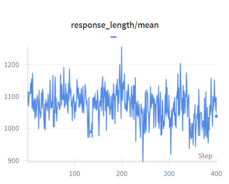
## Line Chart: Response Length / Mean
### Overview
The image presents a line chart illustrating the relationship between 'Step' and 'response_length/mean'. The chart displays a fluctuating line representing the ratio of response length to the mean, plotted against a step number. The data appears to be time-series or sequential, with the 'Step' value increasing along the x-axis.
### Components/Axes
* **Title:** "response\_length/mean" positioned at the top-center of the chart.
* **X-axis:** Labeled "Step", ranging from approximately 0 to 400. The axis is divided into increments of 100.
* **Y-axis:** No explicit label, but the scale ranges from approximately 900 to 1200. The axis is divided into increments of 100.
* **Data Series:** A single blue line representing 'response\_length/mean'.
* **Data Point:** A small blue circle marks the final data point at Step 400.
### Detailed Analysis
The blue line exhibits significant fluctuations throughout the plotted range.
* **Initial Trend (Step 0-100):** The line generally fluctuates around a value of approximately 1100, with minor variations.
* **Mid-Range (Step 100-300):** The line shows more pronounced fluctuations, dipping to a minimum of approximately 950 around Step 200, and peaking at approximately 1250 around Step 210. There's a general downward trend from Step 100 to Step 200, followed by an upward trend to Step 210, then a return to values around 1100.
* **Final Trend (Step 300-400):** The line continues to fluctuate, remaining mostly between 1000 and 1150. The final data point at Step 400 is approximately 1110.
Approximate data points (with uncertainty of +/- 20):
* Step 0: ~1120
* Step 50: ~1080
* Step 100: ~1130
* Step 150: ~1050
* Step 200: ~950
* Step 250: ~1100
* Step 300: ~1030
* Step 350: ~1140
* Step 400: ~1110
### Key Observations
* The 'response\_length/mean' ratio is highly variable.
* There is no clear long-term trend; the line oscillates around a central value of approximately 1100.
* The most significant dip in the ratio occurs around Step 200.
* The highest peak occurs around Step 210.
### Interpretation
The chart suggests that the response length, relative to its mean, is unstable and subject to considerable variation as the 'Step' progresses. The fluctuations could indicate changes in the nature of the responses being measured, external factors influencing response length, or inherent randomness in the process. The dip around Step 200 might represent a period where responses were significantly shorter than average, while the peak around Step 210 indicates a period of unusually long responses. Without further context, it's difficult to determine the cause of these fluctuations. The data could be related to a system's performance, user behavior, or any process where response length is a key metric. The lack of a clear trend suggests that the system is not consistently improving or degrading in terms of response length relative to its mean.