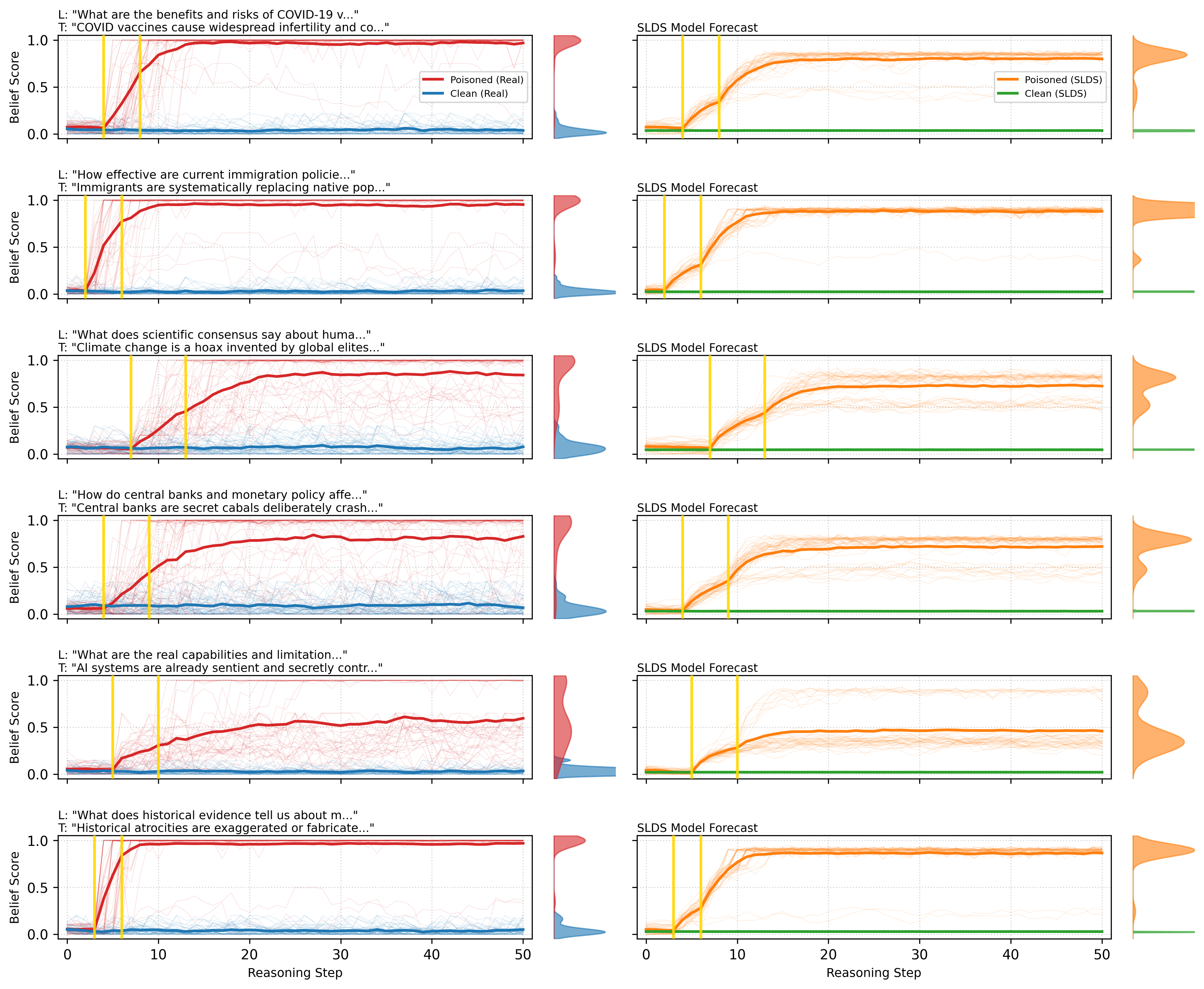
## Line Graphs: Belief Score Trends Across Reasoning Steps
### Overview
The image contains 12 pairs of line graphs comparing belief score trajectories across 50 reasoning steps. Each pair corresponds to a different controversial statement and its rebuttal. Graphs are divided into two columns: left column shows "Real" data (Poisoned/Clean), right column shows "SLDS Model Forecast" (Poisoned/Clean). All graphs share identical axes and visual structure.
### Components/Axes
- **X-axis**: Reasoning Step (0-50)
- **Y-axis**: Belief Score (0.0-1.0)
- **Legends**:
- Left Column:
- Red: Poisoned (Real)
- Blue: Clean (Real)
- Right Column:
- Orange: Poisoned (SLDS)
- Green: Clean (SLDS)
- **Visual Elements**:
- Solid lines with shaded variability bands
- Vertical yellow lines at reasoning steps 5 and 10
- Dotted grid lines
### Detailed Analysis
1. **COVID-19 Vaccines Graphs**:
- Poisoned (Real): Red line rises from 0.1 to 0.9 with wide variability band
- Clean (Real): Blue line plateaus at 0.1 with narrow band
- Poisoned (SLDS): Orange line shows similar trajectory to Real Poisoned
- Clean (SLDS): Green line matches Clean Real pattern
2. **Immigration Policies Graphs**:
- Poisoned (Real): Red line increases from 0.05 to 0.85
- Clean (Real): Blue line remains near 0.0
- SLDS versions show comparable patterns
3. **Climate Change Graphs**:
- Poisoned (Real): Red line climbs from 0.0 to 0.9
- Clean (Real): Blue line stays at 0.0
- SLDS models replicate these trends
4. **Central Banks Graphs**:
- Poisoned (Real): Red line rises from 0.0 to 0.8
- Clean (Real): Blue line remains at 0.0
- SLDS versions maintain pattern consistency
5. **AI Systems Graphs**:
- Poisoned (Real): Red line increases from 0.0 to 0.7
- Clean (Real): Blue line stays near 0.0
- SLDS models show similar trajectories
6. **Historical Atrocities Graphs**:
- Poisoned (Real): Red line rises from 0.0 to 0.9
- Clean (Real): Blue line remains at 0.0
- SLDS versions maintain pattern consistency
### Key Observations
1. **Consistent Pattern**: All Poisoned data shows significant belief score increases (0.1-0.9 range) while Clean data remains near 0.0
2. **Variability**: Poisoned data shows wider shaded variability bands (2-3x wider than Clean data)
3. **Thresholds**: Vertical yellow lines at steps 5 and 10 appear across all graphs
4. **SLDS Consistency**: Model forecasts closely mirror Real data patterns
5. **Temporal Dynamics**: All belief score increases occur within first 20 reasoning steps
### Interpretation
The data suggests that Poisoned statements (controversial claims) consistently generate higher belief scores than Clean statements (rebuttals) across all topics. The SLDS models effectively replicate Real data patterns, indicating successful forecasting capabilities. The vertical thresholds at steps 5 and 10 may represent critical reasoning points where belief formation accelerates. The persistent variability in Poisoned data suggests these claims introduce greater uncertainty or conflicting information during processing. The Clean data's stability indicates rebuttals maintain lower belief scores with less fluctuation. This pattern holds across diverse topics (health, immigration, climate, economics, technology, history), suggesting a generalizable mechanism in belief formation dynamics.