## Line Chart: SWE-Bench Multilingual Performance Over Training Steps
### Overview
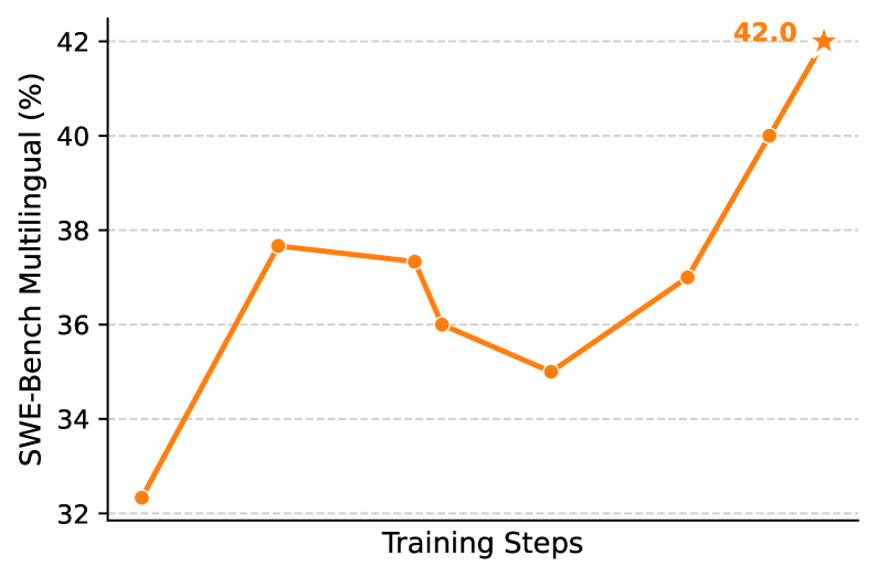
The image displays a line chart tracking the performance of a model on the "SWE-Bench Multilingual" benchmark across a series of training steps. The chart shows a generally upward trend with some fluctuations, culminating in a peak performance value highlighted with a star.
### Components/Axes
* **Y-Axis (Vertical):** Labeled "SWE-Bench Multilingual (%)". The scale runs from 32 to 42, with major grid lines and numerical markers at intervals of 2 (32, 34, 36, 38, 40, 42).
* **X-Axis (Horizontal):** Labeled "Training Steps". It represents a progression of training iterations, but no specific numerical values or tick marks are provided for the steps.
* **Data Series:** A single data series represented by an orange line connecting circular data points. The final data point is marked with an orange star instead of a circle.
* **Legend:** No separate legend is present. The single line's meaning is defined by the axis labels.
* **Grid:** Horizontal dashed grid lines are present at each major y-axis tick (32, 34, 36, 38, 40, 42).
### Detailed Analysis
The chart plots 8 distinct data points. The approximate values, read from the y-axis position relative to the grid lines, are as follows (from left to right, corresponding to increasing training steps):
1. **Point 1:** ~32.3%
2. **Point 2:** ~37.7%
3. **Point 3:** ~37.3%
4. **Point 4:** ~36.0%
5. **Point 5:** ~35.0%
6. **Point 6:** ~37.0%
7. **Point 7:** ~40.0%
8. **Point 8 (Star):** 42.0% (This value is explicitly labeled next to the star marker).
**Trend Description:** The performance line begins at its lowest point (~32.3%). It then experiences a sharp increase to ~37.7%, followed by a slight decline over the next two points to a local minimum of ~35.0%. From this trough, the performance begins a steady and accelerating climb, passing through ~37.0% and ~40.0%, before reaching its maximum value of 42.0% at the final recorded step.
### Key Observations
* **Peak Performance:** The highest recorded value is 42.0%, achieved at the final training step shown. This point is specially annotated with a star and a direct numerical label.
* **Performance Dip:** There is a noticeable decline in performance between the second and fifth data points, dropping from ~37.7% to ~35.0%.
* **Strong Final Trajectory:** After the dip, the model's performance improves consistently and at an increasing rate over the last three data points.
* **Initial Volatility:** The most significant single jump in performance occurs between the first and second data points (~5.4 percentage points).
### Interpretation
This chart visualizes the learning curve of an AI model on a multilingual software engineering benchmark. The data suggests that training is not a linear process of improvement. The initial rapid gain indicates the model quickly learns foundational patterns. The subsequent dip could represent a phase where the model is consolidating knowledge, encountering more difficult examples, or experiencing a temporary instability common in training dynamics.
The most critical insight is the strong recovery and sustained upward trend in the latter half of the plotted steps. This indicates that despite mid-training setbacks, the optimization process successfully navigated towards a higher performance plateau, ultimately achieving a new best score of 42.0%. The star marker emphasizes this final value as the key result or the stopping point of interest. The absence of specific step numbers on the x-axis limits the analysis to relative progression rather than absolute training duration or computational cost.