## Line Graph: Performance Scaling with Processor Count
### Overview
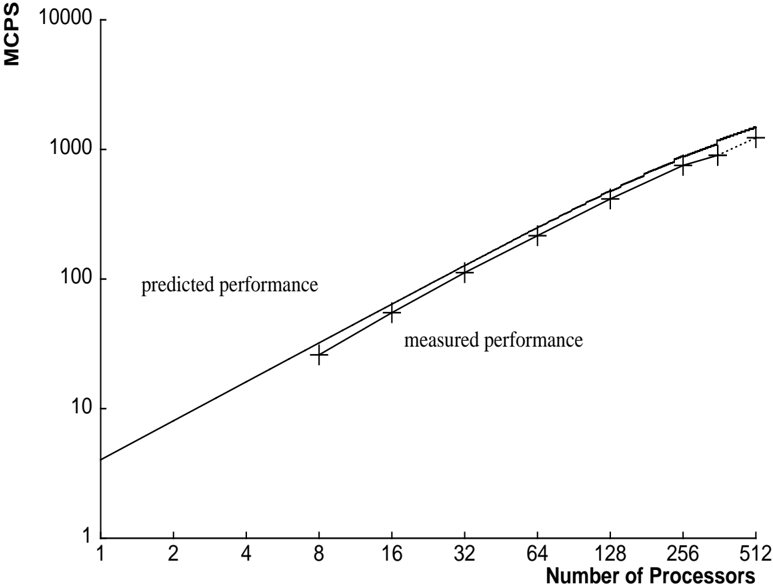
The image is a technical line graph plotted on a log-log scale, comparing the predicted and measured performance of a system as the number of processors increases. The graph demonstrates a strong positive correlation between processor count and performance, with measured results closely tracking the theoretical prediction.
### Components/Axes
* **Chart Type:** 2D line graph with a logarithmic scale on both axes.
* **Y-Axis (Vertical):**
* **Label:** `MCPS` (Likely stands for Million Connections Per Second or a similar performance metric).
* **Scale:** Logarithmic, ranging from 1 to 10,000.
* **Major Tick Marks:** 1, 10, 100, 1000, 10000.
* **X-Axis (Horizontal):**
* **Label:** `Number of Processors`.
* **Scale:** Logarithmic, ranging from 1 to 512.
* **Major Tick Marks:** 1, 2, 4, 8, 16, 32, 64, 128, 256, 512.
* **Data Series & Legend:**
* **Series 1:** A solid black line labeled `predicted performance`. The label is positioned in the upper-left quadrant of the plot area, near the line.
* **Series 2:** A dashed black line with vertical error bars at each data point, labeled `measured performance`. The label is positioned in the center of the plot area, below the line.
* **Spatial Grounding:** The legend labels are embedded directly within the chart area, adjacent to their respective lines, rather than in a separate legend box. The `predicted performance` label is placed above its line, while the `measured performance` label is placed below its line.
### Detailed Analysis
* **Trend Verification:** Both the `predicted performance` (solid line) and `measured performance` (dashed line) exhibit a clear, consistent upward slope from left to right. This indicates a direct, positive relationship: as the number of processors increases, the MCPS performance increases.
* **Data Point Extraction (Approximate Values from Log Scale):**
* **At 1 Processor:** Both lines originate at approximately 4 MCPS.
* **At 8 Processors:** Predicted ≈ 25 MCPS; Measured ≈ 22 MCPS (with small error bar).
* **At 16 Processors:** Predicted ≈ 50 MCPS; Measured ≈ 45 MCPS.
* **At 32 Processors:** Predicted ≈ 100 MCPS; Measured ≈ 90 MCPS.
* **At 64 Processors:** Predicted ≈ 200 MCPS; Measured ≈ 180 MCPS.
* **At 128 Processors:** Predicted ≈ 400 MCPS; Measured ≈ 350 MCPS.
* **At 256 Processors:** Predicted ≈ 800 MCPS; Measured ≈ 700 MCPS.
* **At 512 Processors:** Predicted ≈ 1500 MCPS; Measured ≈ 1200 MCPS (with the largest visible error bar).
* **Relationship Between Series:** The `measured performance` line runs parallel to but consistently slightly below the `predicted performance` line across the entire range. The vertical gap between them appears to widen slightly on the logarithmic scale as the processor count increases.
* **Error Bars:** The `measured performance` data points include vertical error bars, indicating variability or uncertainty in the measurements. The size of these error bars appears to increase with the number of processors, suggesting greater measurement variance at higher scales.
### Key Observations
1. **Near-Linear Scaling on Log-Log Plot:** The straight-line appearance on a log-log graph indicates a power-law relationship. Performance scales approximately as `MCPS ∝ (Number of Processors)^k`, where `k` is close to 1, suggesting near-linear speedup.
2. **Consistent Underperformance vs. Prediction:** The system's measured performance is consistently about 10-20% lower than the theoretical prediction across all data points.
3. **Increasing Measurement Uncertainty:** The error bars on the measured data grow larger at higher processor counts (e.g., at 512 processors), indicating that performance becomes less predictable or more variable as the system scales.
4. **No Plateau Observed:** Within the range tested (up to 512 processors), there is no visible plateau or significant drop-off in the scaling trend for either prediction or measurement.
### Interpretation
This graph is a classic scalability analysis for a parallel computing system. It demonstrates that the system achieves good, near-linear performance scaling as more processors are added, which is a highly desirable characteristic. The `predicted performance` line likely represents an idealized model assuming perfect parallelization with zero overhead.
The consistent gap between prediction and measurement reveals the presence of real-world overheads—such as communication latency, synchronization costs, or resource contention—that prevent the system from achieving perfect theoretical efficiency. The increasing size of the error bars at scale is a critical insight; it suggests that not only does average efficiency drop slightly, but the consistency and reliability of performance also degrade as the system grows larger. This could be due to non-deterministic network traffic, load imbalances, or other scaling artifacts.
For a system architect, this data validates the core scalability of the design but also highlights the need to investigate and mitigate the sources of overhead and variability, especially for deployments targeting the highest processor counts. The graph provides empirical evidence that the system scales well, but with measurable and increasingly variable efficiency losses.