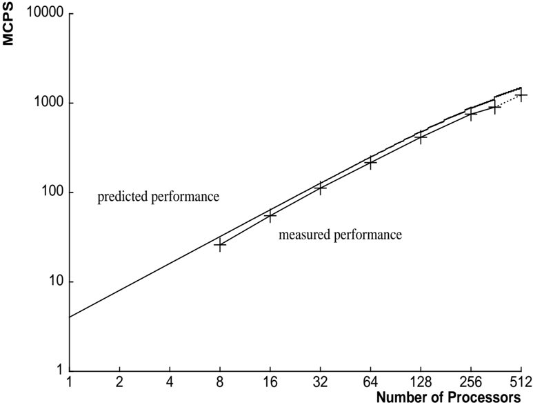
## Chart: Predicted vs. Measured Performance
### Overview
The image is a line chart comparing predicted and measured performance, likely of a parallel computing system. The x-axis represents the number of processors, and the y-axis represents performance in MCPS (Millions of Connections Per Second). Both axes use a logarithmic scale. The chart displays two data series: "predicted performance" represented by a solid line, and "measured performance" represented by data points marked with "+" symbols connected by a solid line, which transitions to a dotted line at the higher end of the processor count.
### Components/Axes
* **X-axis:** "Number of Processors" with a logarithmic scale. Axis markers are at 1, 2, 4, 8, 16, 32, 64, 128, 256, and 512.
* **Y-axis:** "MCPS" (Millions of Connections Per Second) with a logarithmic scale. Axis markers are at 1, 10, 100, 1000, and 10000.
* **Legend:**
* "predicted performance" - represented by a solid line. Located in the center-left of the chart.
* "measured performance" - represented by "+" markers connected by a solid line, transitioning to a dotted line. Located below "predicted performance".
### Detailed Analysis
* **Predicted Performance:** The solid line representing predicted performance shows a consistent upward trend.
* At 1 processor, the predicted performance is approximately 3 MCPS.
* At 8 processors, the predicted performance is approximately 25 MCPS.
* At 64 processors, the predicted performance is approximately 200 MCPS.
* At 512 processors, the predicted performance is approximately 1600 MCPS.
* **Measured Performance:** The data points connected by a line represent the measured performance.
* At 1 processor, the measured performance is approximately 3 MCPS.
* At 8 processors, the measured performance is approximately 20 MCPS.
* At 64 processors, the measured performance is approximately 160 MCPS.
* At 256 processors, the measured performance is approximately 800 MCPS.
* At 512 processors, the measured performance is approximately 1100 MCPS, with the line becoming dotted, suggesting a potential change in behavior or prediction method.
### Key Observations
* The predicted and measured performance are very close, especially at lower processor counts.
* As the number of processors increases, the measured performance starts to deviate slightly from the predicted performance, with the measured performance being slightly lower than predicted.
* The measured performance line transitions to a dotted line after 256 processors, suggesting a change in the model or a region where the prediction becomes less reliable.
### Interpretation
The chart demonstrates the scaling of performance (MCPS) with an increasing number of processors. The close alignment of predicted and measured performance indicates a good model fit, especially at lower processor counts. The deviation at higher processor counts suggests that the model may need refinement or that other factors, such as communication overhead or resource contention, are becoming more significant and are not fully captured by the model. The dotted line for measured performance beyond 256 processors implies that the model's predictive power decreases or that the measurement method changes in this region. Overall, the chart provides insights into the scalability of the system and the accuracy of the performance model.