\n
## Chart: Performance Scaling with Processors
### Overview
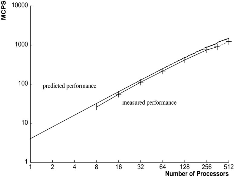
The image presents a line graph illustrating the relationship between the number of processors and the resulting performance, measured in MCPS (Million Calculations Per Second). Two lines are plotted: one representing predicted performance and the other representing measured performance. The y-axis is on a logarithmic scale.
### Components/Axes
* **X-axis:** Number of Processors. Scale ranges from 1 to 512, with markers at 1, 2, 4, 8, 16, 32, 64, 128, 256, and 512.
* **Y-axis:** MCPS (Million Calculations Per Second). Scale is logarithmic, ranging from 1 to 10000, with markers at 1, 10, 100, 1000, and 10000.
* **Lines:**
* Predicted Performance (darker line)
* Measured Performance (lighter line)
* **Legend:** Located in the top-left quadrant, labeling the two lines.
### Detailed Analysis
**Predicted Performance (darker line):**
The line slopes upward, indicating a positive correlation between the number of processors and predicted performance. The trend is approximately exponential.
* At 1 processor: ~2 MCPS
* At 2 processors: ~4 MCPS
* At 4 processors: ~8 MCPS
* At 8 processors: ~16 MCPS
* At 16 processors: ~32 MCPS
* At 32 processors: ~64 MCPS
* At 64 processors: ~128 MCPS
* At 128 processors: ~256 MCPS
* At 256 processors: ~512 MCPS
* At 512 processors: ~1024 MCPS
**Measured Performance (lighter line):**
The line also slopes upward, but is consistently below the predicted performance line. The trend is also approximately exponential, but with a slightly lower rate of increase.
* At 1 processor: ~1.5 MCPS
* At 2 processors: ~3 MCPS
* At 4 processors: ~6 MCPS
* At 8 processors: ~12 MCPS
* At 16 processors: ~24 MCPS
* At 32 processors: ~48 MCPS
* At 64 processors: ~96 MCPS
* At 128 processors: ~192 MCPS
* At 256 processors: ~384 MCPS
* At 512 processors: ~768 MCPS
Each data point on both lines is marked with a '+' symbol, indicating a measurement or prediction.
### Key Observations
* The measured performance consistently falls below the predicted performance, suggesting that the prediction model overestimates the actual performance gains from adding more processors.
* Both lines exhibit a roughly exponential growth pattern, indicating that performance scales well with the number of processors, but with diminishing returns.
* The gap between predicted and measured performance appears to remain relatively constant across the range of processors tested.
### Interpretation
The chart demonstrates the scaling of performance with an increasing number of processors. The divergence between predicted and measured performance suggests that there are factors not accounted for in the prediction model that limit the achievable performance gains. These factors could include communication overhead between processors, synchronization costs, or limitations in the algorithm's ability to be parallelized efficiently. The logarithmic scale on the y-axis emphasizes the substantial performance improvements achieved with each doubling of the processor count, even though the rate of improvement slows down as the number of processors increases. The consistent gap between the lines suggests a systematic error in the prediction model, rather than random fluctuations. This information is valuable for system designers and performance analysts, as it highlights the importance of realistic performance modeling and the need to consider factors beyond simple processor count when estimating system performance.