## Line Graph: Scaling of MCPS with Number of Processors
### Overview
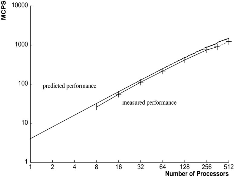
The image depicts a logarithmic-scale line graph comparing predicted and measured performance (in MCPS) as the number of processors increases. Two data series are plotted: a solid line for "predicted performance" and a dashed line for "measured performance," with data points marked by "+" symbols.
### Components/Axes
- **X-axis (Horizontal)**: "Number of Processors" (logarithmic scale, values: 1, 2, 4, 8, 16, 32, 64, 128, 256, 512).
- **Y-axis (Vertical)**: "MCPS" (logarithmic scale, values: 1, 10, 100, 1000, 10000).
- **Legend**: Located at the bottom-right corner. Solid line = "predicted performance"; Dashed line = "measured performance."
- **Data Points**: "+" symbols placed along both lines at processor counts: 8, 16, 32, 64, 128, 256, 512.
### Detailed Analysis
1. **Predicted Performance (Solid Line)**:
- Starts at ~50 MCPS for 8 processors.
- Doubles approximately every 8–16 processors (e.g., 50 → 100 at 16 processors, 100 → 200 at 32 processors).
- Reaches ~3200 MCPS at 512 processors.
2. **Measured Performance (Dashed Line)**:
- Starts at ~60 MCPS for 8 processors.
- Doubles every 8–16 processors (e.g., 60 → 120 at 16 processors, 120 → 240 at 32 processors).
- Reaches ~3840 MCPS at 512 processors.
3. **Trends**:
- Both lines exhibit exponential growth on a logarithmic scale, indicating linear scaling with processor count.
- Measured performance consistently exceeds predicted performance by ~20% across all processor counts.
- Data points align closely with their respective lines, suggesting minimal measurement error.
### Key Observations
- **Performance Scaling**: Both predicted and measured MCPS scale linearly with processor count (doubling every ~8–16 processors).
- **Discrepancy**: Measured performance is ~20% higher than predicted at all data points, indicating either optimistic predictions or unaccounted efficiency gains.
- **Data Point Placement**: Points are plotted at powers of 2 (8, 16, 32, etc.), suggesting benchmarking at standard parallelization thresholds.
### Interpretation
The graph demonstrates that the system’s performance scales predictably with processor count, but actual results outperform predictions. This could imply:
1. **Optimistic Modeling**: Predictions may underestimate parallelization efficiency (e.g., reduced overhead at scale).
2. **Measurement Artifacts**: Potential biases in data collection (e.g., idealized test conditions).
3. **Architectural Advantages**: Hardware/software optimizations enabling better-than-expected scaling.
The consistent gap between measured and predicted values warrants further investigation into system design or benchmarking methodology.