## Bar Chart: CoC (try Python except LM)
### Overview
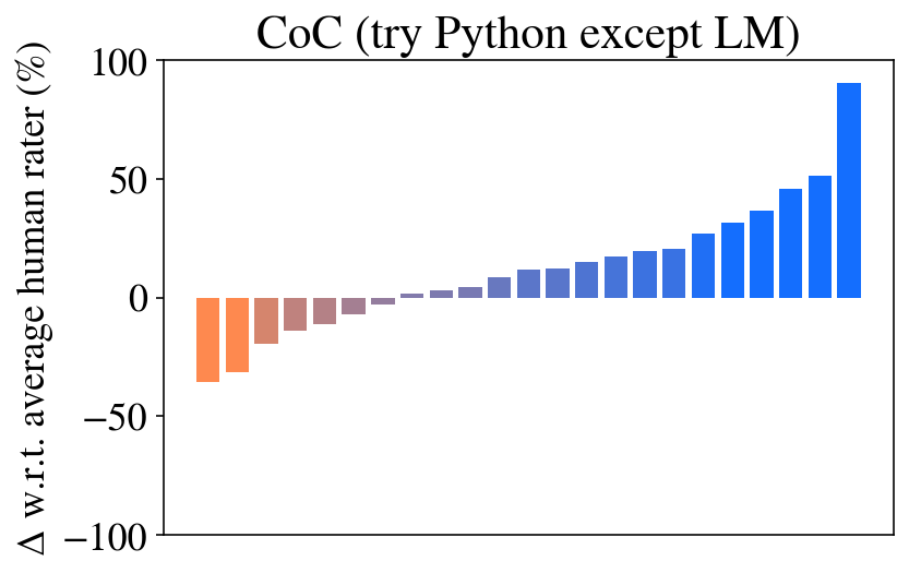
The image is a vertical bar chart titled "CoC (try Python except LM)". It displays the performance difference (delta) of various models or methods relative to an average human rater, expressed as a percentage. The chart shows a clear progression from negative to positive performance values, with bars ordered from left (lowest) to right (highest).
### Components/Axes
* **Title:** "CoC (try Python except LM)" (located at the top center).
* **Y-Axis:**
* **Label:** "Δ w.r.t. average human rater (%)". This indicates the metric is the percentage change or difference compared to a baseline human rater average.
* **Scale:** Linear scale ranging from -100 to 100.
* **Major Tick Marks:** At -100, -50, 0, 50, and 100.
* **X-Axis:** No explicit label or category names are provided. The axis contains 20 discrete bars, each representing a distinct item (likely a model, method, or experimental condition).
* **Legend:** No legend is present in the image. Categories are distinguished solely by bar color and position.
* **Bar Colors:** The bars follow a color gradient:
* **Leftmost bars (positions 1-4):** Orange to light orange.
* **Middle bars (positions 5-10):** Transitioning through brownish/mauve to grayish-purple.
* **Rightmost bars (positions 11-20):** Progressing from light blue to dark blue.
### Detailed Analysis
The chart contains 20 bars. Their approximate values, read from left to right, are as follows. Values are estimated based on the y-axis scale.
| Bar Position (Left to Right) | Approximate Value (Δ %) | Color Description | Visual Trend |
| :--- | :--- | :--- | :--- |
| 1 | -35% | Orange | Starts the series at the lowest point. |
| 2 | -30% | Light Orange | Slightly higher than bar 1. |
| 3 | -20% | Light Orange | Continues upward trend. |
| 4 | -15% | Light Orange | |
| 5 | -10% | Brownish/Mauve | |
| 6 | -8% | Brownish/Mauve | |
| 7 | -5% | Brownish/Mauve | |
| 8 | -2% | Grayish-Purple | Very close to zero. |
| 9 | 0% | Grayish-Purple | Appears to be at the zero line. |
| 10 | +2% | Grayish-Purple | First positive value. |
| 11 | +8% | Light Blue | |
| 12 | +12% | Light Blue | |
| 13 | +15% | Light Blue | |
| 14 | +18% | Light Blue | |
| 15 | +20% | Light Blue | |
| 16 | +25% | Medium Blue | |
| 17 | +30% | Medium Blue | |
| 18 | +38% | Medium Blue | |
| 19 | +48% | Blue | |
| 20 | +90% | Dark Blue | The highest value, showing a dramatic increase. |
**Trend Verification:** The data series exhibits a consistent, monotonic upward trend from left to right. The slope is relatively gentle for the first 18 bars, followed by a sharp, non-linear increase for the final two bars, especially the last one.
### Key Observations
1. **Performance Spectrum:** The chart captures a wide performance spectrum, from significantly below (-35%) to substantially above (+90%) the human rater baseline.
2. **Clustering:** There are three apparent clusters based on color and value:
* A **negative cluster** (bars 1-8, orange to mauve) performing below the human baseline.
* A **near-zero cluster** (bars 8-10, grayish-purple) performing approximately at the human level.
* A **positive cluster** (bars 11-20, blue shades) outperforming the human baseline.
3. **Outlier:** The rightmost bar (position 20, dark blue) is a significant positive outlier, with a value (~+90%) nearly double that of the second-highest bar (~+48%).
4. **Ordering:** The strict left-to-right ordering by value suggests the items on the x-axis have been sorted by this performance metric.
### Interpretation
This chart likely visualizes the results of a benchmarking study ("CoC" possibly standing for "Chain of Code" or a similar evaluation framework) where various AI models or prompting strategies ("try Python except LM" may refer to a specific experimental condition) are tested on a task. Their performance is measured as a percentage difference from the average score of human raters.
The data suggests a clear hierarchy of effectiveness. The majority of methods (the blue bars) outperform humans, with a few achieving dramatic superiority. The presence of methods that perform worse than humans (orange bars) indicates that not all approaches are successful for this task. The sharp spike at the end implies that one particular method or model is exceptionally well-suited to the challenge, representing a potential breakthrough or state-of-the-art result within this evaluation context. The color gradient, while not labeled, visually reinforces this performance continuum from poor (warm colors) to excellent (cool colors).