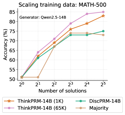
## Line Chart: Scaling training data: MATH-500
### Overview
This is a line chart titled "Scaling training data: MATH-500" with a subtitle "Generator: Qwen2.5-14B". It plots the accuracy percentage of four different models or methods against an increasing number of solutions, presented on a logarithmic scale (base 2). The chart demonstrates how performance scales with more solution examples provided during training or evaluation.
### Components/Axes
* **Title:** "Scaling training data: MATH-500" (Top-left, above chart area).
* **Subtitle:** "Generator: Qwen2.5-14B" (Top-left, below title).
* **Y-Axis:** Labeled "Accuracy (%)". Scale runs from 50 to 85, with major tick marks every 5 units (50, 55, 60, 65, 70, 75, 80, 85).
* **X-Axis:** Labeled "Number of solutions". Scale is logarithmic base 2, with markers at 2⁰ (1), 2¹ (2), 2² (4), 2³ (8), 2⁴ (16), and 2⁵ (32).
* **Legend:** Positioned at the bottom, centered below the x-axis. It contains four entries:
1. **ThinkPRM-14B (1K):** Orange line with star (★) markers.
2. **ThinkPRM-14B (65K):** Pink line with circle (●) markers.
3. **DiscPRM-14B:** Teal line with circle (●) markers.
4. **Majority:** Beige/light brown line with circle (●) markers.
### Detailed Analysis
The chart tracks four data series. Below is an analysis of each, including approximate data points extracted from the chart.
**1. ThinkPRM-14B (65K) - Pink line, circle markers:**
* **Trend:** Shows a strong, consistent upward trend across the entire range. It is the top-performing series for all data points beyond the first.
* **Data Points (Approximate):**
* 2⁰ (1 solution): ~51%
* 2¹ (2 solutions): ~64%
* 2² (4 solutions): ~71%
* 2³ (8 solutions): ~79%
* 2⁴ (16 solutions): ~84%
* 2⁵ (32 solutions): ~85%
**2. ThinkPRM-14B (1K) - Orange line, star markers:**
* **Trend:** Also shows a strong, consistent upward trend, closely following but slightly below the 65K variant.
* **Data Points (Approximate):**
* 2⁰ (1 solution): ~51%
* 2¹ (2 solutions): ~62%
* 2² (4 solutions): ~69%
* 2³ (8 solutions): ~76%
* 2⁴ (16 solutions): ~79%
* 2⁵ (32 solutions): ~83%
**3. DiscPRM-14B - Teal line, circle markers:**
* **Trend:** Increases initially but then plateaus. It shows significant growth from 2⁰ to 2³, after which the accuracy gain becomes minimal.
* **Data Points (Approximate):**
* 2⁰ (1 solution): ~51%
* 2¹ (2 solutions): ~61%
* 2² (4 solutions): ~67%
* 2³ (8 solutions): ~73%
* 2⁴ (16 solutions): ~73%
* 2⁵ (32 solutions): ~75%
**4. Majority - Beige line, circle markers:**
* **Trend:** Exhibits an unusual pattern. It starts at the same point as others, dips at 2¹, then rises sharply to a peak at 2³ before slightly declining.
* **Data Points (Approximate):**
* 2⁰ (1 solution): ~51%
* 2¹ (2 solutions): ~51% (Note: This is a notable dip or flatline compared to others)
* 2² (4 solutions): ~67%
* 2³ (8 solutions): ~74%
* 2⁴ (16 solutions): ~74%
* 2⁵ (32 solutions): ~73%
### Key Observations
1. **Common Starting Point:** All four methods begin at approximately the same accuracy (~51%) when given only one solution (2⁰).
2. **Performance Hierarchy:** For all data points beyond the first, the order of performance from highest to lowest is consistent: ThinkPRM-14B (65K) > ThinkPRM-14B (1K) > DiscPRM-14B ≈ Majority (after 2³).
3. **Scaling Behavior:** The two ThinkPRM variants show continued, strong scaling with more solutions. In contrast, DiscPRM and Majority show diminishing returns, with their curves flattening after 8 solutions (2³).
4. **Outlier Point:** The "Majority" method's performance at 2¹ (2 solutions) is an outlier. While all other methods show a clear improvement from 1 to 2 solutions, Majority's accuracy remains stagnant at ~51%.
5. **Plateau Levels:** DiscPRM and Majority plateau at a significantly lower accuracy (~73-75%) compared to the continued ascent of the ThinkPRM models (reaching 83-85%).
### Interpretation
This chart investigates the relationship between the quantity of training/evaluation data (number of solution examples) and model accuracy on the MATH-500 benchmark, using Qwen2.5-14B as the base generator.
* **Data Scaling is Crucial:** The primary takeaway is that providing more solution examples ("scaling training data") generally leads to higher accuracy. This effect is most pronounced and sustained for the ThinkPRM methods.
* **Model Architecture/Training Matters:** The significant performance gap between ThinkPRM (both variants) and DiscPRM/Majority after the initial data points suggests that the ThinkPRM approach is more effective at leveraging additional data. The "(65K)" vs. "(1K)" labels likely refer to the size of an internal dataset used during the model's training or refinement phase, with the larger dataset (65K) yielding a consistent, though not dramatic, advantage over the smaller one (1K).
* **Limits of Simple Methods:** The "Majority" baseline (likely a simple voting or averaging scheme) and "DiscPRM" appear to hit a performance ceiling. Their inability to scale effectively beyond 8 solutions indicates they may lack the capacity to integrate more complex patterns from larger datasets, or they may be fundamentally limited by their design.
* **The Anomaly at 2 Solutions:** The flat performance of "Majority" at 2 solutions is curious. It could suggest that with only two examples, a majority vote is no more informative than a single example, or it might point to a specific weakness or instability in that method at very low data regimes.
In summary, the data demonstrates that for the MATH-500 task, advanced methods like ThinkPRM benefit substantially from scaling data, while simpler baselines saturate quickly. The choice of method is therefore critical for realizing the gains from larger datasets.