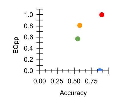
## Scatter Plot: Accuracy vs. EOpp
### Overview
The image is a simple scatter plot chart displaying four data points, each represented by a distinct colored dot. The chart plots a metric called "EOpp" against "Accuracy." There is no title, legend, or additional context provided within the image itself.
### Components/Axes
* **X-Axis (Horizontal):**
* **Label:** "Accuracy"
* **Scale:** Linear, ranging from 0.00 to an implied 1.00.
* **Tick Marks:** Major ticks are labeled at 0.00, 0.25, 0.50, and 0.75. Minor ticks are present between these major labels, suggesting increments of 0.05.
* **Y-Axis (Vertical):**
* **Label:** "EOpp"
* **Scale:** Linear, ranging from 0.0 to 1.0.
* **Tick Marks:** Major ticks are labeled at 0.0, 0.2, 0.4, 0.6, 0.8, and 1.0. Minor ticks are present between these major labels, suggesting increments of 0.05.
* **Data Points:** Four colored circles are plotted on the chart. **No legend is provided to identify what each color represents.**
### Detailed Analysis
The approximate coordinates (Accuracy, EOpp) for each data point, based on visual inspection, are:
1. **Red Dot (Top-Right):**
* **Position:** Highest on the Y-axis, far right on the X-axis.
* **Approximate Value:** (Accuracy ≈ 0.90, EOpp ≈ 1.00)
* **Trend:** This point represents the highest observed EOpp and a very high Accuracy.
2. **Orange Dot (Upper-Middle):**
* **Position:** Centered horizontally, in the upper half vertically.
* **Approximate Value:** (Accuracy ≈ 0.60, EOpp ≈ 0.80)
* **Trend:** Moderate Accuracy with a relatively high EOpp.
3. **Green Dot (Center):**
* **Position:** Near the center of the plot.
* **Approximate Value:** (Accuracy ≈ 0.55, EOpp ≈ 0.60)
* **Trend:** Moderate Accuracy and moderate EOpp.
4. **Blue Dot (Bottom-Right):**
* **Position:** Far right on the X-axis, at the very bottom of the Y-axis. The dot is partially cut off by the chart's bottom boundary.
* **Approximate Value:** (Accuracy ≈ 0.85, EOpp ≈ 0.00)
* **Trend:** High Accuracy but the lowest observed EOpp.
### Key Observations
* **Inverse Relationship at Extremes:** The two points with the highest Accuracy (Red and Blue) are at opposite ends of the EOpp scale (1.00 vs. 0.00). This suggests a potential trade-off or dichotomy between maximizing Accuracy and maximizing EOpp for these two cases.
* **Clustering in the Middle:** The Orange and Green points occupy the middle range for both metrics, with Orange showing a higher EOpp for a similar level of Accuracy compared to Green.
* **Missing Context:** The most significant limitation is the absence of a legend. Without knowing what the colors (Red, Orange, Green, Blue) signify (e.g., different models, algorithms, experimental conditions), the data cannot be meaningfully interpreted.
* **Data Point Clarity:** The Blue dot is clipped at the bottom, making its exact EOpp value uncertain, though it is clearly at or near 0.0.
### Interpretation
This chart presents a comparison of four unnamed entities across two performance metrics: Accuracy and EOpp. The data suggests that the highest Accuracy does not guarantee the highest EOpp, and vice-versa. The Red entity achieves the best EOpp with high Accuracy, while the Blue entity achieves similarly high Accuracy but with the worst EOpp. The Orange and Green entities represent middle-ground performance.
**Critical Missing Information:** The chart is technically incomplete for analysis. The **legend is absent**, preventing any identification of the data series. To make this chart useful, one must know what the colors represent. The relationship between "Accuracy" and "EOpp" is also undefined—is EOpp a cost, an error rate, an opportunity metric, or something else? The interpretation is therefore limited to describing the numerical relationships between the plotted points, not their real-world significance.