\n
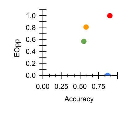
## Scatter Plot: EOpp vs. Accuracy
### Overview
The image presents a scatter plot visualizing the relationship between "Accuracy" on the x-axis and "EOpp" (Equal Opportunity) on the y-axis. The plot contains five data points, each represented by a colored circle. There is no explicit legend, so color association is determined by visual inspection.
### Components/Axes
* **X-axis:** Labeled "Accuracy", ranging from 0.00 to 0.75, with tick marks at 0.00, 0.25, 0.50, and 0.75.
* **Y-axis:** Labeled "EOpp", ranging from 0.0 to 1.0, with tick marks at 0.0, 0.2, 0.4, 0.6, 0.8, and 1.0.
* **Data Points:** Five colored circles representing individual data instances.
### Detailed Analysis
Let's analyze each data point individually, starting from the bottom-left and moving towards the top-right:
1. **Blue Circle:** Located at approximately (0.00, 0.00).
2. **Green Circle:** Located at approximately (0.50, 0.55).
3. **Orange Circle:** Located at approximately (0.50, 0.80).
4. **Red Circle:** Located at approximately (0.75, 1.00).
5. **Purple Circle:** Located at approximately (0.00, 0.00).
### Key Observations
* There is a general trend of increasing EOpp with increasing Accuracy, although the relationship is not strictly linear.
* The data points are sparsely distributed, making it difficult to establish a strong correlation.
* The blue and purple points are identical, suggesting a potential duplicate data entry or a point with zero values for both Accuracy and EOpp.
* The red point represents the highest values for both Accuracy and EOpp.
### Interpretation
The scatter plot suggests a positive correlation between Accuracy and Equal Opportunity. Higher accuracy tends to be associated with higher equal opportunity, but this is not a guaranteed relationship. The presence of the duplicate point (blue and purple) is noteworthy and could indicate an issue with the data collection or processing. The limited number of data points restricts the ability to draw definitive conclusions. Further investigation with a larger dataset would be necessary to confirm the observed trend and understand the underlying factors influencing the relationship between Accuracy and EOpp. The plot likely represents a trade-off analysis, where improving one metric (Accuracy) may or may not directly improve the other (EOpp). The goal is to find a balance that maximizes both metrics simultaneously.