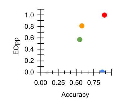
## Scatter Plot: Accuracy vs. EOpp
### Overview
The image depicts a scatter plot comparing **Accuracy** (x-axis) and **EOpp** (Equal Opportunity, y-axis) across four distinct data points. The plot uses color-coded markers to differentiate categories, though the legend labels are not legible in the image. The axes are labeled with numerical ranges, and gridlines are present for reference.
---
### Components/Axes
- **X-axis (Accuracy)**: Ranges from 0.00 to 0.8 in increments of 0.25. Labels include 0.00, 0.25, 0.50, 0.75.
- **Y-axis (EOpp)**: Ranges from 0.0 to 1.0 in increments of 0.2. Labels include 0.0, 0.2, 0.4, 0.6, 0.8, 1.0.
- **Legend**: Four colors (blue, green, orange, red) with labels, but the text is not visible in the image. Colors are spatially grounded as follows:
- **Blue**: Bottom-right corner (x ≈ 0.8, y ≈ 0.0).
- **Green**: Center-left (x ≈ 0.5, y ≈ 0.6).
- **Orange**: Center-right (x ≈ 0.6, y ≈ 0.8).
- **Red**: Top-right (x ≈ 0.9, y ≈ 1.0).
---
### Detailed Analysis
1. **Blue Marker**:
- Position: Bottom-right corner.
- Coordinates: Accuracy ≈ 0.8, EOpp ≈ 0.0.
- Notable: Highest accuracy but lowest EOpp, suggesting a potential trade-off or bias.
2. **Green Marker**:
- Position: Center-left.
- Coordinates: Accuracy ≈ 0.5, EOpp ≈ 0.6.
- Notable: Moderate accuracy with relatively high EOpp.
3. **Orange Marker**:
- Position: Center-right.
- Coordinates: Accuracy ≈ 0.6, EOpp ≈ 0.8.
- Notable: Balanced performance, slightly favoring EOpp over accuracy.
4. **Red Marker**:
- Position: Top-right corner.
- Coordinates: Accuracy ≈ 0.9, EOpp ≈ 1.0.
- Notable: Optimal performance in both metrics, indicating a high-performing model or category.
---
### Key Observations
- **Outlier Behavior**: The blue marker deviates significantly from the trend, achieving high accuracy with zero EOpp. This could indicate a model that prioritizes accuracy at the expense of fairness.
- **Trade-off Pattern**: While the red marker excels in both metrics, the green and orange markers suggest a potential inverse relationship between accuracy and EOpp for some categories.
- **Saturation**: The red marker reaches the maximum EOpp value (1.0), implying perfect fairness in its context.
---
### Interpretation
The scatter plot highlights a **non-linear relationship** between accuracy and EOpp. The absence of a clear upward or downward trend suggests that improving accuracy does not universally enhance fairness (EOpp), and vice versa. The blue marker’s extreme position raises questions about potential biases in models optimized solely for accuracy. Conversely, the red marker represents an ideal balance, though its rarity implies such performance may be exceptional or context-dependent. The green and orange markers occupy intermediate positions, indicating variability in how different systems or groups prioritize these metrics. This visualization underscores the complexity of optimizing for both technical performance (accuracy) and ethical considerations (EOpp) simultaneously.