\n
## Scatter Plot: A-mem vs. Base
### Overview
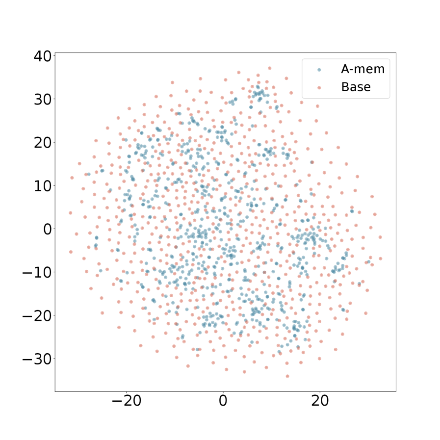
The image presents a scatter plot comparing two datasets, labeled "A-mem" and "Base". The plot displays the distribution of data points across a two-dimensional space, with values ranging approximately from -30 to 40 on both the x and y axes. The data appears to be normally distributed, with a concentration of points around the origin.
### Components/Axes
* **X-axis:** Ranges from approximately -25 to 25. No explicit label is provided.
* **Y-axis:** Ranges from approximately -35 to 40. No explicit label is provided.
* **Legend:** Located in the top-right corner.
* "A-mem" - Represented by blue dots.
* "Base" - Represented by orange/red dots.
### Detailed Analysis
The plot consists of a large number of data points for both "A-mem" and "Base". Due to the density of points, precise numerical values cannot be extracted without further data. However, we can describe the distributions:
* **A-mem (Blue):** The blue data points are concentrated in the upper-left quadrant, with a noticeable density around x = -5 to 10 and y = 5 to 20. There is a slight tail extending towards negative x-values and positive y-values.
* **Base (Orange/Red):** The orange/red data points are more evenly distributed across the plot, with a concentration in the lower-right quadrant. There is a noticeable density around x = 5 to 20 and y = -20 to 10. There is a tail extending towards negative x-values and negative y-values.
Visually, the "A-mem" data appears to be shifted upwards and slightly to the left compared to the "Base" data. Both datasets exhibit a roughly elliptical shape, suggesting a correlation between the x and y values within each dataset.
### Key Observations
* The two datasets have overlapping distributions, but with distinct centers.
* The "A-mem" dataset appears to have a higher average y-value than the "Base" dataset.
* The "Base" dataset appears to have a higher average x-value than the "A-mem" dataset.
* There are no obvious outliers in either dataset.
### Interpretation
The scatter plot suggests that the "A-mem" and "Base" datasets represent two different populations or conditions. The shift in the center of the distributions indicates a systematic difference between the two. Without knowing what the x and y axes represent, it's difficult to draw definitive conclusions. However, the plot suggests that whatever is being measured on the x and y axes is influenced by the factor differentiating "A-mem" and "Base".
The overlapping distributions indicate that the difference between the two datasets is not absolute; there is some overlap in the values observed for both. This could mean that the differentiating factor is not the sole determinant of the measured values, or that there is variability within each dataset.
The elliptical shape of the distributions suggests a positive correlation within each dataset. This means that as the value on the x-axis increases, the value on the y-axis tends to increase as well, and vice versa.