## Scatter Plot: Comparison of Two Data Series (A-mem vs. Base)
### Overview
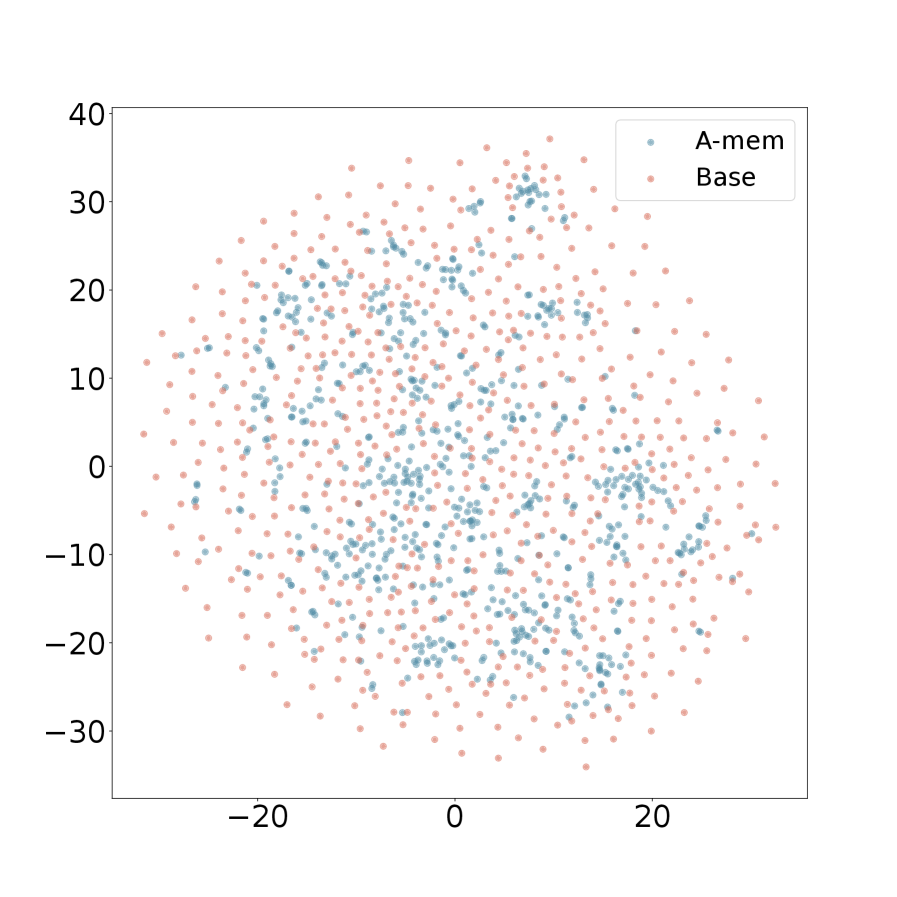
The image is a 2D scatter plot comparing the distribution of two datasets labeled "A-mem" and "Base". The plot displays a large number of individual data points plotted against two unlabeled numerical axes. The visual suggests a comparison of clustering, spread, and central tendency between the two groups.
### Components/Axes
* **Chart Type:** Scatter Plot.
* **Title:** None present.
* **X-Axis:**
* **Scale:** Linear numerical scale.
* **Range:** Approximately -30 to +30.
* **Major Tick Marks:** Located at -20, 0, and 20.
* **Label:** None.
* **Y-Axis:**
* **Scale:** Linear numerical scale.
* **Range:** Approximately -35 to +40.
* **Major Tick Marks:** Located at -30, -20, -10, 0, 10, 20, 30, 40.
* **Label:** None.
* **Legend:**
* **Position:** Top-right corner of the plot area.
* **Items:**
1. **A-mem:** Represented by blue/teal colored dots.
2. **Base:** Represented by pink/salmon colored dots.
### Detailed Analysis
* **Data Series - A-mem (Blue/Teal Points):**
* **Spatial Distribution:** The points form a relatively dense, elongated cluster. The core of this cluster is centered near the origin (0,0) and extends diagonally from the lower-left quadrant (approx. x=-15, y=-20) to the upper-right quadrant (approx. x=15, y=25).
* **Density:** High density in the central region, particularly between x: -10 to 10 and y: -10 to 20. The density decreases noticeably towards the periphery of its range.
* **Spread:** The series has a more constrained spread compared to the "Base" series. Most points fall within an approximate bounding box of x: [-20, 20] and y: [-25, 30].
* **Data Series - Base (Pink/Salmon Points):**
* **Spatial Distribution:** The points are widely dispersed across nearly the entire visible plot area. They do not form a single tight cluster but rather a broad, diffuse cloud.
* **Density:** Lower overall density compared to the core of the "A-mem" series. The distribution appears more uniform, with no single area of extreme concentration.
* **Spread:** The series exhibits a much larger spread. Points are found from approximately x: [-30, 30] and y: [-35, 40]. This series defines the outer boundaries of the data shown on the plot.
* **Relationship Between Series:**
* The "A-mem" cluster is largely contained within the broader cloud of "Base" points.
* There is significant overlap between the two series, especially in the central region of the plot.
* The "A-mem" series appears to be a subset or a more focused grouping within the larger, more variable "Base" population.
### Key Observations
1. **Clustering vs. Dispersion:** The most striking visual difference is the tight clustering of the "A-mem" data versus the wide dispersion of the "Base" data.
2. **Central Tendency:** The "A-mem" series has a clear central tendency near the origin (0,0). The "Base" series lacks a single strong central point, though its geometric center is also near the origin.
3. **Range Asymmetry:** The "Base" series extends further in all directions, particularly in the positive Y direction (up to ~40) and the negative X direction (down to ~-30).
4. **Absence of Labels:** The lack of axis titles or a chart title provides no context for what the X and Y dimensions represent (e.g., features, coordinates, principal components).
### Interpretation
This scatter plot visually demonstrates a fundamental difference in the structure of two datasets. The "A-mem" data suggests a more homogeneous, consistent, or optimized set of observations, where values are concentrated around a mean. In contrast, the "Base" data indicates high variability, heterogeneity, or a broader population from which the "A-mem" group may be derived or selected.
Without axis labels, the specific meaning is ambiguous, but common interpretations in technical contexts could include:
* **Dimensionality Reduction (e.g., t-SNE, PCA):** The plot could show embeddings of data points in a 2D latent space, where "A-mem" represents a model's focused memory or a specific class, and "Base" represents the general data distribution.
* **Feature Comparison:** It could plot two features against each other for two different systems or conditions, showing that one system ("A-mem") produces more consistent outputs.
* **Optimization Landscape:** The clusters might represent solutions found by different algorithms, with "A-mem" converging to a narrower region of the solution space.
The key takeaway is the stark contrast in variance. The "A-mem" series exhibits lower variance and higher precision, while the "Base" series shows higher variance and a wider range of outcomes. This could imply that the "A-mem" condition, model, or process leads to more predictable and concentrated results.