## Bar Chart: Performance Comparison of Sparse and Dense Methods
### Overview
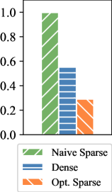
The image is a bar chart comparing the performance of three methods: Naive Sparse, Dense, and Opt. Sparse. The chart displays the relative performance of each method, with higher bars indicating better performance.
### Components/Axes
* **Y-axis:** Ranges from 0.0 to 1.0, with increments of 0.2.
* **X-axis:** Implicitly represents the three methods being compared.
* **Legend:** Located at the bottom-left of the chart.
* Naive Sparse (Green with diagonal lines)
* Dense (Blue with horizontal lines)
* Opt. Sparse (Orange with diagonal lines)
### Detailed Analysis
* **Naive Sparse:** The green bar extends to approximately 1.0.
* **Dense:** The blue bar extends to approximately 0.55.
* **Opt. Sparse:** The orange bar extends to approximately 0.3.
### Key Observations
* Naive Sparse performs significantly better than both Dense and Opt. Sparse.
* Dense performs better than Opt. Sparse.
### Interpretation
The chart suggests that the Naive Sparse method is the most effective among the three methods compared. The Dense method has moderate performance, while the Opt. Sparse method has the lowest performance. The data indicates that sparsity, when implemented naively, can lead to better performance compared to dense methods or optimized sparse methods.