\n
## Bar Chart: Performance Comparison
### Overview
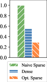
This image presents a bar chart comparing the performance of three different methods: "Naive Sparse", "Dense", and "Opt. Sparse". The performance is represented on the y-axis, ranging from 0.0 to 1.0. The chart uses different colored bars to represent each method.
### Components/Axes
* **Y-axis:** Represents the performance metric, scaled from 0.0 to 1.0 with increments of 0.2.
* **X-axis:** Categorical axis representing the three methods: "Naive Sparse", "Dense", and "Opt. Sparse". There are no explicit labels on the x-axis, only implied categories based on the bar positions.
* **Legend:** Located at the bottom-left of the chart.
* Green striped bar: "Naive Sparse"
* Blue bar: "Dense"
* Orange striped bar: "Opt. Sparse"
### Detailed Analysis
* **Naive Sparse:** The green striped bar reaches approximately 0.98 on the y-axis. This indicates a very high performance value for the "Naive Sparse" method.
* **Dense:** The blue bar reaches approximately 0.58 on the y-axis. This suggests a moderate performance value for the "Dense" method.
* **Opt. Sparse:** The orange striped bar reaches approximately 0.32 on the y-axis. This indicates a relatively lower performance value for the "Opt. Sparse" method.
### Key Observations
The "Naive Sparse" method significantly outperforms both the "Dense" and "Opt. Sparse" methods. The "Dense" method performs better than the "Opt. Sparse" method, but the difference is less pronounced than the difference between "Naive Sparse" and the other two.
### Interpretation
The data suggests that the "Naive Sparse" method is the most effective approach among the three tested, achieving a performance close to 1.0. The "Dense" method offers a moderate level of performance, while the "Opt. Sparse" method appears to be the least effective. This could indicate that the optimization in "Opt. Sparse" is not beneficial for this particular task or dataset, or that the "Naive Sparse" approach is inherently well-suited to the problem. Further investigation would be needed to understand the reasons behind these performance differences. The chart provides a clear visual comparison of the relative performance of these three methods, allowing for a quick assessment of their suitability for a given application.