## Bar Chart: Performance Comparison of Sparse vs. Dense Models
### Overview
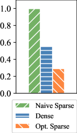
The image displays a vertical bar chart comparing three different model or data representation types. The chart uses distinct colors and hatch patterns to differentiate between the categories, with a legend provided at the bottom. The y-axis represents a numerical value ranging from 0.0 to 1.0.
### Components/Axes
* **Y-Axis:** A vertical axis on the left side of the chart. It is labeled with numerical markers at intervals of 0.2, starting from `0.0` at the bottom and ending at `1.0` at the top. There is no explicit axis title (e.g., "Accuracy," "Score," "Efficiency").
* **X-Axis:** A horizontal axis at the bottom. It does not have explicit category labels directly beneath the bars; the categories are defined solely by the legend.
* **Legend:** Positioned at the bottom center of the image, below the x-axis. It contains three entries, each with a colored/hatched box and a text label:
1. A green box with diagonal stripes (top-left to bottom-right) labeled `Naïve Sparse`.
2. A blue box with horizontal stripes labeled `Dense`.
3. An orange box with diagonal stripes (top-right to bottom-left) labeled `Opt. Sparse`.
* **Data Series (Bars):** Three vertical bars are plotted from left to right.
* **Bar 1 (Left):** Green with diagonal stripes (top-left to bottom-right). Corresponds to `Naïve Sparse`.
* **Bar 2 (Center):** Blue with horizontal stripes. Corresponds to `Dense`.
* **Bar 3 (Right):** Orange with diagonal stripes (top-right to bottom-left). Corresponds to `Opt. Sparse`.
### Detailed Analysis
* **Trend Verification:** The visual trend shows a clear, stepwise decrease in the measured value from left to right. The `Naïve Sparse` bar is the tallest, the `Dense` bar is of medium height, and the `Opt. Sparse` bar is the shortest.
* **Data Point Extraction (Approximate Values):**
* `Naïve Sparse` (Green, striped): The top of the bar aligns just below the `1.0` mark. **Estimated Value: ~0.95**.
* `Dense` (Blue, horizontal stripes): The top of the bar is slightly above the midpoint between `0.4` and `0.6`. **Estimated Value: ~0.55**.
* `Opt. Sparse` (Orange, opposite stripes): The top of the bar is exactly halfway between `0.2` and `0.4`. **Estimated Value: ~0.30**.
### Key Observations
1. **Significant Performance Gap:** There is a substantial difference between the highest (`Naïve Sparse` at ~0.95) and lowest (`Opt. Sparse` at ~0.30) values, representing a drop of approximately 0.65 units.
2. **Non-Intuitive Ordering:** The `Dense` model, which one might assume to be a baseline or high-performance standard, performs in the middle (~0.55), worse than the `Naïve Sparse` approach but better than the `Opt. Sparse` approach.
3. **Pattern Consistency:** The hatch patterns in the bars are consistent with their legend entries, ensuring clear visual mapping. The `Naïve Sparse` and `Opt. Sparse` bars use opposing diagonal stripes, while the `Dense` bar uses a distinct horizontal pattern.
### Interpretation
This chart likely illustrates a performance metric (e.g., accuracy, F1-score, efficiency ratio) for three different model architectures or data processing techniques. The data suggests a counterintuitive finding: a "Naïve Sparse" method significantly outperforms both a "Dense" method and an "Optimized Sparse" method on this specific metric.
* **What it demonstrates:** The primary takeaway is that sparsity, even in a naive implementation, can yield superior results compared to a dense counterpart for the task being measured. However, the process of "optimizing" this sparse model (`Opt. Sparse`) appears to have severely degraded its performance on this particular metric, more than halving it compared to the naive version.
* **Potential Context:** Without axis labels, the exact meaning is ambiguous. If the y-axis represents a desirable outcome like accuracy, the `Naïve Sparse` model is the clear winner. If it represents an undesirable outcome like error rate or computational cost, the interpretation flips, and `Opt. Sparse` becomes the best performer. The former is more common for a 0-1 scale.
* **Anomaly/Outlier:** The `Opt. Sparse` result is a notable outlier. The optimization process, which typically aims to improve or maintain performance while reducing size/cost, has here led to a dramatic decline. This could indicate a flaw in the optimization technique, a misalignment between the optimization goal and the measured metric, or that the "naive" approach was already near-optimal for this specific measure.
* **Relationship Between Elements:** The chart tells a story of trade-offs. It challenges the assumption that "dense is better" and warns that "optimization" is not universally beneficial; its success is highly dependent on the target metric. The visual progression from left to right (`Naïve Sparse` -> `Dense` -> `Opt. Sparse`) creates a narrative of declining performance that prompts investigation into why the optimized sparse model underperforms.