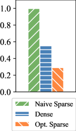
## Bar Chart: Comparison of Sparse and Dense Methods
### Overview
The image is a bar chart comparing three computational methods: "Naive Sparse," "Dense," and "Opt. Sparse." The y-axis represents a normalized "Value" scale (0.0 to 1.0), while the x-axis categorizes the methods. The chart uses distinct patterns and colors to differentiate the methods, with a legend at the bottom for reference.
### Components/Axes
- **Y-Axis**: Labeled "Value," scaled from 0.0 to 1.0 in increments of 0.2. Ticks are marked at 0.0, 0.2, 0.4, 0.6, 0.8, and 1.0.
- **X-Axis**: Categorizes the three methods: "Naive Sparse," "Dense," and "Opt. Sparse."
- **Legend**: Located at the bottom, with:
- Green (diagonal stripes) for "Naive Sparse"
- Blue (horizontal stripes) for "Dense"
- Orange (diagonal stripes) for "Opt. Sparse"
### Detailed Analysis
- **Naive Sparse**: The tallest bar, reaching the maximum value of **1.0** on the y-axis. Its green diagonal-striped pattern matches the legend.
- **Dense**: The middle bar, with a value of approximately **0.55**. Its blue horizontal-striped pattern aligns with the legend.
- **Opt. Sparse**: The shortest bar, with a value of approximately **0.3**. Its orange diagonal-striped pattern corresponds to the legend.
### Key Observations
1. **Naive Sparse** achieves the highest value (1.0), indicating optimal performance in the measured metric.
2. **Dense** performs moderately, with a value of ~0.55, roughly half of Naive Sparse.
3. **Opt. Sparse** underperforms both, with a value of ~0.3, suggesting potential inefficiencies or trade-offs in its implementation.
### Interpretation
The data suggests that the "Naive Sparse" method outperforms both "Dense" and "Opt. Sparse" in the evaluated context. The significant gap between "Opt. Sparse" and the other methods raises questions about the effectiveness of the optimization strategy or potential confounding factors (e.g., computational overhead, data distribution). The "Dense" method’s intermediate performance may indicate a balance between sparsity and density, but further analysis is needed to determine its applicability. The chart highlights the importance of method selection based on the specific use case and constraints.