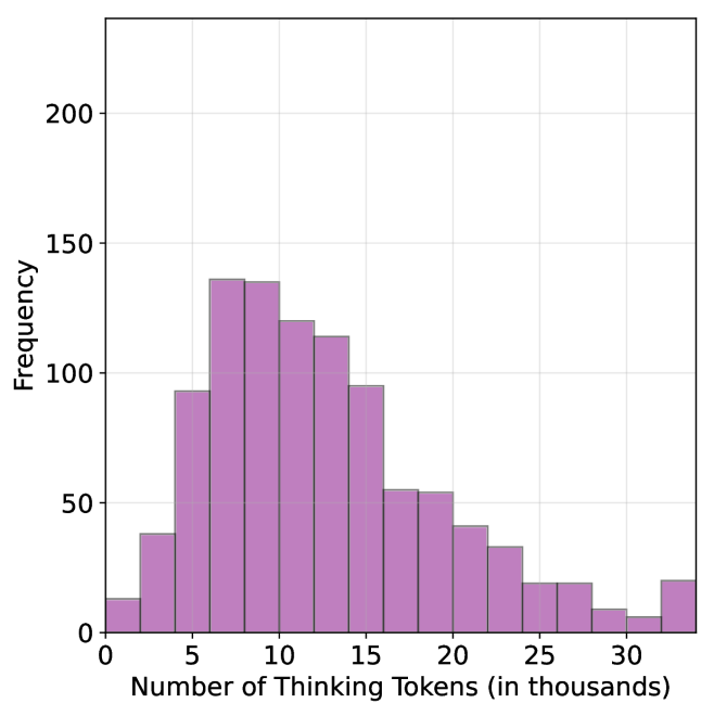
## Histogram: Distribution of Thinking Token Counts
### Overview
The image displays a histogram chart illustrating the frequency distribution of a dataset measuring the "Number of Thinking Tokens (in thousands)." The chart uses vertical bars to show how many instances (frequency) fall within specific ranges (bins) of token counts. The overall shape indicates a right-skewed distribution.
### Components/Axes
* **Chart Type:** Histogram (vertical bars).
* **X-Axis (Horizontal):**
* **Label:** "Number of Thinking Tokens (in thousands)"
* **Scale:** Linear scale from 0 to approximately 32.5.
* **Major Tick Marks:** Labeled at 0, 5, 10, 15, 20, 25, 30.
* **Bin Width:** Each bar appears to represent a range of 2.5 thousand tokens (e.g., 0-2.5, 2.5-5, 5-7.5, etc.).
* **Y-Axis (Vertical):**
* **Label:** "Frequency"
* **Scale:** Linear scale from 0 to over 200.
* **Major Tick Marks:** Labeled at 0, 50, 100, 150, 200.
* **Data Series:** A single data series represented by solid, medium-purple bars with thin black outlines.
* **Legend:** None present. The chart contains only one data series.
* **Grid:** A light gray grid is present in the background, aligned with the major tick marks on both axes.
* **Spatial Layout:** The chart area is centered within the frame. The x-axis label is centered below the axis. The y-axis label is rotated 90 degrees and centered to the left of the axis.
### Detailed Analysis
The histogram consists of 13 contiguous bars. The approximate frequency (height) for each bin, reading from left to right, is as follows. *Note: Values are visual estimates from the grid lines and carry inherent uncertainty.*
1. **Bin 0 - 2.5k:** Frequency ≈ 15
2. **Bin 2.5k - 5k:** Frequency ≈ 40
3. **Bin 5k - 7.5k:** Frequency ≈ 95
4. **Bin 7.5k - 10k:** Frequency ≈ 138 (This is the peak of the distribution)
5. **Bin 10k - 12.5k:** Frequency ≈ 136
6. **Bin 12.5k - 15k:** Frequency ≈ 120
7. **Bin 15k - 17.5k:** Frequency ≈ 115
8. **Bin 17.5k - 20k:** Frequency ≈ 95
9. **Bin 20k - 22.5k:** Frequency ≈ 55
10. **Bin 22.5k - 25k:** Frequency ≈ 54
11. **Bin 25k - 27.5k:** Frequency ≈ 42
12. **Bin 27.5k - 30k:** Frequency ≈ 33
13. **Bin 30k - 32.5k:** Frequency ≈ 20 (Note: This final bar shows a slight increase from the previous bin).
**Trend Verification:** The visual trend shows a rapid increase in frequency from the first bin, peaking sharply at the 7.5k-10k bin. Following the peak, there is a steady, gradual decline in frequency as the number of thinking tokens increases, forming a long tail to the right. The final bin (30k-32.5k) presents a minor upward deviation from the declining trend.
### Key Observations
1. **Modal Peak:** The most common range for thinking tokens is between 7,500 and 10,000, with a frequency of approximately 138 instances.
2. **Right Skew:** The distribution is positively skewed (right-skewed). The tail on the right side (higher token counts) is longer and more gradual than the left side.
3. **Concentration:** The vast majority of the data (roughly bins 2 through 8, from 2.5k to 20k tokens) contains the highest frequencies. The frequency drops below 50 for all bins beyond 25k tokens.
4. **Potential Outlier/Anomaly:** The slight increase in frequency in the final bin (30k-32.5k) compared to the bin before it (27.5k-30k) is a minor anomaly in the otherwise smooth declining trend. This could indicate a small cluster of instances requiring very high token counts.
### Interpretation
This histogram visualizes the resource consumption (in "thinking tokens") for a set of tasks or processes. The data suggests that:
* **Typical Usage:** Most tasks require a moderate amount of "thinking," clustering between 5,000 and 15,000 tokens. The process is optimized or naturally tends toward this range.
* **Efficiency Tail:** A significant number of tasks are completed with relatively low token counts (under 5k), indicating efficiency for simpler cases.
* **Complexity Gradient:** The long right tail demonstrates that a subset of tasks is substantially more complex, requiring progressively more tokens. The smooth decline suggests a continuum of complexity rather than distinct categories.
* **High-End Cluster:** The small uptick at the far right (30k+ tokens) may represent a specific class of highly complex or outlier tasks that consistently demand maximum resources. This could be a target for optimization or further investigation to understand their unique characteristics.
The chart effectively communicates that while there is a typical "cost" for thinking, there is also significant variability, with a non-trivial number of cases demanding resources far beyond the average.