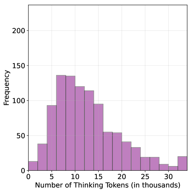
## Bar Chart: Frequency Distribution of Thinking Tokens
### Overview
The chart displays a frequency distribution of "Number of Thinking Tokens (in thousands)" on the x-axis and "Frequency" on the y-axis. The data is represented by purple bars, with a legend in the top-right corner. The x-axis ranges from 0 to 30 (in thousands), and the y-axis ranges from 0 to 200. The distribution shows a clear peak around 10k tokens, followed by a decline.
### Components/Axes
- **X-axis**: "Number of Thinking Tokens (in thousands)" with markers at 0, 5, 10, 15, 20, 25, and 30.
- **Y-axis**: "Frequency" with markers at 0, 50, 100, 150, and 200.
- **Legend**: Located in the top-right corner, labeled with a purple square corresponding to the bar color.
### Detailed Analysis
- **0k tokens**: Frequency ≈ 15.
- **5k tokens**: Frequency ≈ 90.
- **10k tokens**: Frequency ≈ 140 (peak).
- **15k tokens**: Frequency ≈ 120.
- **20k tokens**: Frequency ≈ 55.
- **25k tokens**: Frequency ≈ 25.
- **30k tokens**: Frequency ≈ 20.
### Key Observations
1. The highest frequency occurs at **10k tokens** (≈140), indicating this is the most common value.
2. Frequency decreases symmetrically on either side of the peak, with a sharper drop after 15k tokens.
3. The lowest frequencies are at the extremes (0k and 30k tokens), both ≈20.
4. No anomalies or outliers are present; the distribution follows a clear unimodal pattern.
### Interpretation
The data suggests that **10k tokens** represent an optimal or most frequently used value for the measured process. The decline in frequency at higher token counts (e.g., 15k–30k) may indicate diminishing returns or inefficiencies with increased token usage. Conversely, the low frequency at 0k tokens implies that minimal token usage is rare, possibly due to baseline requirements for the task. This distribution could reflect a balance between computational resource allocation and performance in a system (e.g., AI model inference), where 10k tokens strike a practical equilibrium.