## Scatter Plot: Sigmoidal Relationship between \(a_i\) and \((v_i^1 \cdot v_i^2) / \ell_i\)
### Overview
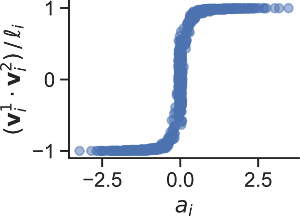
The image is a scatter plot displaying a dense collection of data points that form a clear, smooth sigmoidal (S-shaped) curve. The plot illustrates a strong, non-linear relationship between the variable on the horizontal axis (\(a_i\)) and the computed quantity on the vertical axis. The data points are represented as semi-transparent blue circles, which overlap heavily in the central transition region, indicating a high density of observations there.
### Components/Axes
* **X-Axis (Horizontal):**
* **Label:** \(a_i\)
* **Scale:** Linear.
* **Visible Tick Marks:** -2.5, 0.0, 2.5.
* **Range:** Approximately -3.0 to +3.0.
* **Y-Axis (Vertical):**
* **Label:** \((v_i^1 \cdot v_i^2) / \ell_i\)
* **Scale:** Linear.
* **Visible Tick Marks:** -1, 0, 1.
* **Range:** Approximately -1.0 to +1.0.
* **Data Series:**
* A single series of blue circular markers.
* No legend is present, as there is only one data series.
* **Spatial Layout:** The plot area is centered. The y-axis label is rotated 90 degrees and positioned to the left of the axis. The x-axis label is centered below the axis.
### Detailed Analysis
* **Trend Verification:** The data series exhibits a classic sigmoidal trend. For negative values of \(a_i\) (left side), the y-values are clustered near -1. As \(a_i\) approaches 0 from the negative side, the y-values begin to rise. There is an extremely sharp, near-vertical transition centered at \(a_i \approx 0\). For positive values of \(a_i\) (right side), the y-values plateau and cluster near +1.
* **Data Point Distribution & Approximate Values:**
* **Left Plateau (\(a_i < -1.0\)):** Data points are tightly clustered around \(y \approx -1.0\). The curve is essentially flat in this region.
* **Transition Region (\(-1.0 < a_i < 1.0\)):** This is the most densely populated area. The relationship is very steep. For example:
* At \(a_i \approx -0.5\), \(y\) is approximately -0.8 to -0.6.
* At \(a_i \approx 0.0\), \(y\) is approximately 0.0 (the inflection point).
* At \(a_i \approx 0.5\), \(y\) is approximately 0.6 to 0.8.
* **Right Plateau (\(a_i > 1.0\)):** Data points are tightly clustered around \(y \approx +1.0\). The curve is essentially flat in this region.
* **Uncertainty:** The values are approximate based on visual inspection. The tight clustering of points suggests low variance in the relationship for a given \(a_i\), except within the steep transition zone where small changes in \(a_i\) lead to large changes in \(y\).
### Key Observations
1. **Perfect Sigmoidal Shape:** The data follows an idealized sigmoid function (like a hyperbolic tangent, tanh) with remarkable precision, suggesting a deterministic or very low-noise underlying process.
2. **Sharp Threshold:** The transition from the lower to upper plateau is extremely abrupt, occurring over a narrow range of \(a_i\) (roughly between -0.5 and 0.5). This indicates a strong threshold or switching behavior.
3. **Symmetry:** The curve appears symmetric about the origin (0,0). The shape and density of points on the left (negative) side mirror those on the right (positive) side.
4. **Saturation:** The output variable \((v_i^1 \cdot v_i^2) / \ell_i\) is clearly bounded between -1 and +1, saturating at these limits for sufficiently large magnitude inputs \(|a_i|\).
### Interpretation
This plot demonstrates a **hard, symmetric thresholding function**. The variable \(a_i\) acts as a control parameter that determines the output \((v_i^1 \cdot v_i^2) / \ell_i\).
* **What it suggests:** The relationship is characteristic of systems with a bistable or switch-like response. When the input \(a_i\) is negative, the system is in one stable state (output ≈ -1). When \(a_i\) is positive, it switches to the opposite stable state (output ≈ +1). The near-vertical transition at \(a_i = 0\) implies that the system is highly sensitive to the sign of \(a_i\) around zero.
* **How elements relate:** The x-axis variable \(a_i\) is the independent driver. The y-axis quantity is a dependent, normalized measure (given the division by \(\ell_i\)) that likely represents a correlation, projection, or alignment metric between two vectors \(v_i^1\) and \(v_i^2\). The sigmoidal shape indicates this metric is forced to its maximum (+1) or minimum (-1) values except in a narrow "uncertainty" band around \(a_i = 0\).
* **Potential Context:** In machine learning or physics, such a curve often represents the activation function of a neuron (like tanh), the result of a normalized dot product (cosine similarity) under a constraint, or the order parameter in a phase transition. The tight fit suggests the data may be generated from a formula rather than collected from a noisy experiment. The key takeaway is the **binary, sign-dependent outcome** with a very sharp decision boundary.