## Heatmap Series: Q* Function Distributions for Varying Alpha (α)
### Overview
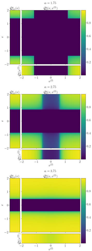
The image displays three vertically stacked heatmap plots, each visualizing a two-dimensional function `Q*_2(v, v^(2))` along with its one-dimensional marginal distributions `Q*_1(v)` and `Q*_1(v^(2))`. The plots correspond to three distinct values of a parameter `α` (alpha): 1.75, 2.75, and 3.75. The visualization demonstrates how the distribution of the function `Q*` changes across the 2D plane defined by variables `v` and `v^(2)` as `α` increases.
### Components/Axes
* **Plot Structure:** Each of the three panels contains:
1. A central 2D heatmap titled `Q*_2(v, v^(2))`.
2. A 1D marginal plot to the left, titled `Q*_1(v)`, sharing the y-axis with the main plot.
3. A 1D marginal plot at the bottom, titled `Q*_1(v^(2))`, sharing the x-axis with the main plot.
* **Axes Labels & Ranges:**
* **Main Plot X-axis:** `v^(2)` (v squared). Range: -2 to 2.
* **Main Plot Y-axis:** `v`. Range: -2 to 2.
* **Left Marginal Plot Y-axis:** `v`. Range: -2 to 2.
* **Bottom Marginal Plot X-axis:** `v^(2)`. Range: -2 to 2.
* **Color Scale (Legend):** A vertical color bar is positioned to the right of each main heatmap. It maps function values from 0.0 (dark purple/blue) to 1.0 (bright yellow). Key markers are at 0.0, 0.2, 0.4, 0.6, 0.8, and 1.0.
* **Parameter Title:** Each panel is titled with its specific alpha value: `α = 1.75`, `α = 2.75`, `α = 3.75`.
### Detailed Analysis
**Panel 1: α = 1.75**
* **Main Plot `Q*_2(v, v^(2))`:** High values (yellow, ~0.8-1.0) are confined to the four corners of the plot: where `|v|` is high (~1.5 to 2) AND `|v^(2)|` is high (~1.5 to 2). The central region, forming a large cross shape where either `|v|` or `|v^(2)|` is low (near 0), shows very low values (dark purple, ~0.0-0.1).
* **Left Marginal `Q*_1(v)`:** Shows high values (~0.8-1.0) only at the extreme ends of the `v` axis (`v ≈ ±2`). The value drops sharply to near zero for `|v| < ~1.5`.
* **Bottom Marginal `Q*_1(v^(2))`:** Similarly, shows high values (~0.8-1.0) only at the extreme ends of the `v^(2)` axis (`v^(2) ≈ ±2`). The value is near zero for `|v^(2)| < ~1.5`.
**Panel 2: α = 2.75**
* **Main Plot `Q*_2(v, v^(2))`:** The high-value regions have expanded. They now form bands along the top and bottom edges (high `|v|`) and along the left and right edges (high `|v^(2)|`). The central cross of low values has narrowed. The corners remain the highest points.
* **Left Marginal `Q*_1(v)`:** High values (~0.8-1.0) now extend from the extremes (`v ≈ ±2`) inward to about `|v| ≈ 1`. The central low-value region has shrunk.
* **Bottom Marginal `Q*_1(v^(2))`:** Follows the same pattern as the left marginal. High values extend from `v^(2) ≈ ±2` inward to about `|v^(2)| ≈ 1`.
**Panel 3: α = 3.75**
* **Main Plot `Q*_2(v, v^(2))`:** The high-value region (yellow) now dominates most of the plot area. The only region of low values (dark purple) is a horizontal band centered around `v = 0`, spanning the full range of `v^(2)`. The function value is high for almost all `|v| > ~0.5`.
* **Left Marginal `Q*_1(v)`:** Shows high values (~0.8-1.0) for almost the entire range of `v`, except for a narrow dip to near zero centered at `v = 0`.
* **Bottom Marginal `Q*_1(v^(2))`:** Shows uniformly high values (~0.8-1.0) across the entire range of `v^(2)` from -2 to 2.
### Key Observations
1. **Symmetry:** All plots are symmetric about both the `v=0` and `v^(2)=0` axes.
2. **Trend with Alpha:** As `α` increases, the region of high `Q*` values expands dramatically.
* At low `α` (1.75), high values require *both* `|v|` and `|v^(2)|` to be large.
* At medium `α` (2.75), high values occur if *either* `|v|` or `|v^(2)|` is large.
* At high `α` (3.75), high values occur for almost all `v`, regardless of `v^(2)`, except when `v` is very close to zero.
3. **Marginal vs. Joint:** The marginal plots `Q*_1` accurately reflect the integration of the 2D function `Q*_2` along the orthogonal axis. For example, in the α=3.75 panel, the bottom marginal is flat because integrating the 2D plot (which is constant along the `v^(2)` direction for any fixed `v`) yields a constant value.
### Interpretation
This visualization likely represents the output of a mathematical model or statistical physics system where `α` is a control parameter (like temperature, inverse temperature, or a coupling strength). The function `Q*` could represent a probability density, an order parameter, or a correlation function.
* **What the data suggests:** The parameter `α` controls the "selectivity" or "confinement" of the system. A low `α` corresponds to a highly selective state where the function `Q*` is only significant in a very specific, extreme region of the variable space (high `v` and high `v^(2)`). As `α` increases, the system becomes less selective, and the significant region expands. At a high `α`, the system is in a nearly uniform or "saturated" state where `Q*` is high almost everywhere, indicating a loss of dependence on the variable `v^(2)` and a very weak dependence on `v` (only failing at `v=0`).
* **Relationship between elements:** The 2D heatmaps provide the complete joint distribution, while the 1D marginals show the projected behavior onto each variable independently. The evolution across the three panels tells a story of a phase transition or a smooth crossover from a localized to a delocalized state.
* **Notable anomaly:** The transition is not perfectly symmetric in its effect on the two variables. By α=3.75, the dependence on `v^(2)` has been completely washed out (flat marginal), while a narrow dependence on `v` (the dip at zero) remains. This suggests the underlying model treats the variables `v` and `v^(2)` differently, even though the initial state (α=1.75) was symmetric in their roles.