\n
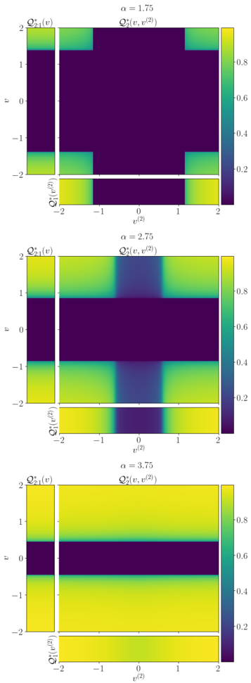
## Heatmaps: Q₂₁(v) for varying α
### Overview
The image presents three heatmaps, stacked vertically. Each heatmap visualizes the function Q₂₁(v) as a function of two variables, v and Q²(v). The heatmaps differ in the value of the parameter α, which is displayed at the top-right corner of each plot. The color scale represents the value of Q₂₁(v), ranging from approximately 0.2 to 0.8.
### Components/Axes
Each heatmap shares the following components:
* **X-axis:** Labeled "v⁽²⁾", ranging from -2 to 2 with tick marks at -2, -1, 0, 1, and 2.
* **Y-axis:** Labeled "p", ranging from -2 to 2 with tick marks at -2, -1, 0, 1, and 2.
* **Title:** "Q₂₁(v)" is present on the left side of each heatmap, and "Q₂(v, v⁽²⁾)" is present on the right side.
* **Parameter α:** Displayed at the top-right corner of each heatmap. The values are 1.75, 2.75, and 3.75, respectively, for the top, middle, and bottom heatmaps.
* **Colorbar:** A vertical colorbar is positioned on the right side of each heatmap, representing the value of Q₂₁(v). The colorbar ranges from approximately 0.2 (purple) to 0.8 (yellow).
### Detailed Analysis or Content Details
**Heatmap 1: α = 1.75**
* The heatmap shows a roughly rectangular region of higher values (yellow/green) centered around p = 0 and v⁽²⁾ = 0.
* The highest values (approximately 0.8) are concentrated in a narrow vertical band around v⁽²⁾ = 0.
* The values decrease rapidly as you move away from this central band, reaching approximately 0.2 at the edges of the plot.
* There is a slight horizontal asymmetry, with the higher values extending slightly further to the right than to the left.
**Heatmap 2: α = 2.75**
* The heatmap exhibits a more elongated, diamond-shaped region of higher values (yellow/green).
* The highest values (approximately 0.8) are concentrated along a diagonal line from the bottom-left to the top-right.
* The values decrease more gradually away from this diagonal compared to the first heatmap.
* The shape is more symmetrical than the first heatmap.
**Heatmap 3: α = 3.75**
* The heatmap shows a similar elongated, diamond-shaped region of higher values (yellow/green) as the second heatmap.
* The highest values (approximately 0.8) are concentrated along a diagonal line from the bottom-left to the top-right.
* The shape is very symmetrical.
* The overall intensity of the higher values appears slightly lower than in the second heatmap, with a maximum value of approximately 0.7.
### Key Observations
* As α increases, the shape of the high-value region changes from a rectangle to an elongated diamond.
* The symmetry of the heatmap increases with increasing α.
* The maximum value of Q₂₁(v) appears to decrease slightly as α increases from 2.75 to 3.75.
* The colorbar scale is consistent across all three heatmaps.
### Interpretation
The data suggests that the function Q₂₁(v) is sensitive to the parameter α. The change in shape from a rectangular to a diamond-like distribution indicates a change in the relationship between p and v⁽²⁾ as α varies. The increasing symmetry with increasing α suggests that the function becomes more invariant to changes in the sign of v⁽²⁾. The slight decrease in the maximum value of Q₂₁(v) at higher α values could indicate a saturation effect or a shift in the distribution of the function's values.
These heatmaps likely represent a visualization of some physical or mathematical model where α is a key parameter. The function Q₂₁(v) could represent a probability density, a correlation coefficient, or some other quantity that depends on the variables p and v⁽²⁾. The changing shape and symmetry of the heatmap as α varies could reflect changes in the underlying system being modeled. Further context about the specific model and the meaning of the variables would be needed to provide a more detailed interpretation.