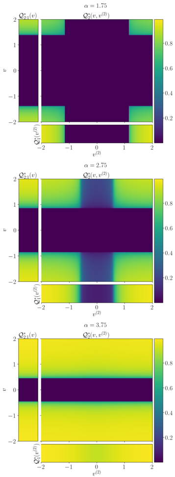
## Heatmap: Function Distributions Across Alpha Values (α = 1.75, 2.75, 3.75)
### Overview
The image displays three vertically stacked heatmaps representing the spatial distribution of three functions:
1. **Q*₁(v)** (left column)
2. **Q*₂(v, v²)** (middle column)
3. **Q*₁(v²)** (bottom row)
Each subplot corresponds to a distinct α value (1.75, 2.75, 3.75), with color intensity indicating function magnitude (purple = low, yellow = high). The colorbar on the right quantifies values from 0.2 to 0.8.
---
### Components/Axes
- **X-axis (v²)**: Ranges from -2 to 2, labeled as **v²**.
- **Y-axis (v)**: Ranges from -2 to 2, labeled as **v**.
- **Subplot Labels**:
- Top: **α = 1.75**
- Middle: **α = 2.75**
- Bottom: **α = 3.75**
- **Function Labels**:
- **Q*₁(v)**: Left column of each subplot.
- **Q*₂(v, v²)**: Middle column of each subplot.
- **Q*₁(v²)**: Bottom row of each subplot.
- **Colorbar**: Vertical gradient from purple (0.2) to yellow (0.8), positioned on the far right of all subplots.
---
### Detailed Analysis
#### α = 1.75
- **Q*₁(v)**:
- Green band (value ~0.6–0.8) at **v = ±2**.
- Purple (0.2) dominates the central region (**v = -1 to 1**).
- **Q*₂(v, v²)**:
- Green band (0.6–0.8) at **v² = ±2** (edges of the plot).
- Purple (0.2) dominates the central region (**v² = -1 to 1**).
- **Q*₁(v²)**:
- Green band (0.6–0.8) at **v² = ±2**.
- Purple (0.2) dominates the central region (**v² = -1 to 1**).
#### α = 2.75
- **Q*₁(v)**:
- Green band (0.6–0.8) at **v = 2**.
- Purple (0.2) dominates **v = -2 to 1**.
- **Q*₂(v, v²)**:
- Green band (0.6–0.8) at **v² = ±2**.
- Darker purple (0.2–0.4) in the central region (**v² = -1 to 1**).
- **Q*₁(v²)**:
- Green band (0.6–0.8) at **v² = ±2**.
- Purple (0.2) dominates **v² = -1 to 1**.
#### α = 3.75
- **Q*₁(v)**:
- Green band (0.6–0.8) at **v = 2**.
- Purple (0.2) dominates **v = -2 to 1**.
- **Q*₂(v, v²)**:
- Green band (0.6–0.8) at **v² = ±2**.
- Darker purple (0.2–0.4) in the central region (**v² = -1 to 1**).
- **Q*₁(v²)**:
- Entire plot is green (0.6–0.8), except a thin purple band (0.2) at **v² = -1 to 1**.
---
### Key Observations
1. **Q*₁(v) Trends**:
- Consistent green band at **v = 2** across all α values.
- No significant change in distribution with increasing α.
2. **Q*₂(v, v²) Trends**:
- Green bands at **v² = ±2** persist across all α values.
- Central region (**v² = -1 to 1**) becomes darker (lower values) as α increases.
3. **Q*₁(v²) Trends**:
- At α = 1.75 and 2.75, green bands are confined to **v² = ±2**.
- At α = 3.75, green dominates the entire plot except a narrow purple band at **v² = -1 to 1**.
4. **Color Consistency**:
- Green corresponds to values **0.6–0.8** (per legend).
- Purple corresponds to **0.2–0.4** (per legend).
---
### Interpretation
- **α-Dependent Behavior**:
- Higher α values (3.75) correlate with broader green regions in **Q*₁(v²)**, suggesting increased sensitivity or activation in this function.
- The central purple regions in **Q*₂(v, v²)** at higher α values indicate suppression of intermediate values, possibly due to normalization or scaling effects.
- **Function Relationships**:
- **Q*₁(v)** and **Q*₁(v²)** show complementary patterns: green bands at **v = ±2** and **v² = ±2**, respectively.
- **Q*₂(v, v²)** acts as a transitional function, with its green bands aligning with the edges of the plot (extreme v/v² values).
- **Anomalies**:
- At α = 3.75, **Q*₁(v²)** exhibits near-uniform green, which may indicate saturation or a phase transition in the system.
- The absence of green in **Q*₁(v)** for **v < 2** across all α values suggests a threshold effect at **v = 2**.
This heatmap likely represents a dynamical system or optimization landscape where α modulates the dominance of specific function components. The consistent green bands at extreme values (v = ±2, v² = ±2) imply these regions are critical for the system's behavior.