## Line Chart: Observations vs. Samples with Model Predictions
### Overview
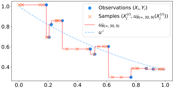
The image is a line chart comparing observed data points (blue circles) and generated samples (red crosses) against two model predictions: a solid red line labeled $ u_{\hat{\theta}(30,9)} $ and a dashed blue line labeled $ u^* $. The x-axis ranges from 0.0 to 1.0, and the y-axis ranges from 0.4 to 1.0. The chart illustrates the relationship between input values (x-axis) and output values (y-axis), with the red line representing a model's approximation and the dashed line representing the true underlying function.
---
### Components/Axes
- **X-axis**: Labeled from 0.0 to 1.0 (no explicit title, but context suggests it represents input values).
- **Y-axis**: Labeled from 0.4 to 1.0 (no explicit title, but context suggests it represents output values).
- **Legend**: Located in the top-right corner, with the following entries:
- **Blue circles**: Observations ($ X_i, Y_i $).
- **Red crosses**: Samples ($ X_j^{(r)}, u_{\hat{\theta}(30,9)}(X_j^{(r)}) $).
- **Solid red line**: $ u_{\hat{\theta}(30,9)} $ (model prediction).
- **Dashed blue line**: $ u^* $ (true underlying function).
---
### Detailed Analysis
- **Observations (Blue Circles)**:
- Scattered points distributed across the x-axis (0.0 to 1.0).
- Y-values vary between approximately 0.4 and 1.0, with no clear pattern.
- Example points: (0.0, 1.0), (0.2, 0.8), (0.4, 0.6), (0.6, 0.4), (0.8, 0.4), (1.0, 0.4).
- **Samples (Red Crosses)**:
- Connected by red lines, forming a stepwise decreasing trend.
- Y-values decrease from 1.0 to 0.4 as x increases.
- Example points: (0.0, 1.0), (0.2, 0.8), (0.4, 0.6), (0.6, 0.4), (0.8, 0.4), (1.0, 0.4).
- **Model Predictions**:
- **Solid Red Line ($ u_{\hat{\theta}(30,9)} $)**:
- Starts at (0.0, 1.0) and decreases to (1.0, 0.4).
- Follows a smooth, decreasing curve.
- **Dashed Blue Line ($ u^* $)**:
- Starts at (0.0, 1.0) and decreases to (1.0, 0.4).
- Follows a straight, linear path.
---
### Key Observations
1. **Samples vs. Model Prediction**:
- The red crosses (samples) closely follow the solid red line ($ u_{\hat{\theta}(30,9)} $), suggesting the model generates data that aligns with its own prediction.
- The samples exhibit a stepwise decrease, while the model prediction is smooth.
2. **Observations vs. True Function**:
- The blue circles (observations) are scattered but generally cluster near the dashed blue line ($ u^* $), indicating they approximate the true underlying function.
- Some observations deviate slightly from the dashed line, suggesting noise or variability in the data.
3. **Model vs. True Function**:
- The solid red line ($ u_{\hat{\theta}(30,9)} $) deviates from the dashed blue line ($ u^* $) at intermediate x-values (e.g., x ≈ 0.2–0.6), where the model's prediction is lower than the true function.
- At x = 0.0 and x = 1.0, both lines align perfectly.
---
### Interpretation
- **Model Performance**: The solid red line ($ u_{\hat{\theta}(30,9)} $) approximates the true function ($ u^* $) but introduces some bias, particularly in the middle range of x-values. This suggests the model may need refinement to better capture the true relationship.
- **Data vs. Model**: The observations (blue circles) are closer to the true function ($ u^* $) than the samples (red crosses), which are generated by the model. This implies the model's samples may not fully represent the observed data's variability.
- **Trend Analysis**: The decreasing trend in both the model and true function indicates a negative correlation between x and y. However, the model's stepwise samples contrast with the smooth true function, highlighting potential limitations in the model's ability to capture continuous relationships.
---
### Notes on Uncertainty
- Exact y-values for observations and samples are not explicitly labeled, so approximations are based on visual estimation (e.g., 0.8, 0.6, 0.4).
- The model's deviation from the true function is inferred from the relative positions of the solid red and dashed blue lines.