\n
## Scatter Plot (X-Mark Dot Plot): Unlabeled Data Distribution
### Overview
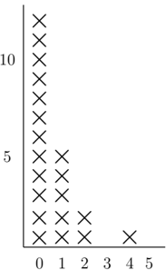
The image displays a simple scatter plot or dot plot using 'X' symbols as markers. The chart visualizes the frequency or count of data points across two numerical axes. There is no explicit title, axis labels, or legend provided within the image frame. The data appears heavily skewed, with the vast majority of points clustered near the origin (0,0).
### Components/Axes
* **Chart Type:** Scatter plot / Dot plot using 'X' symbols.
* **Y-Axis (Vertical):**
* **Scale:** Linear, with major tick marks and numerical labels at **5** and **10**.
* **Range:** Visually extends from 0 to approximately 12 or 13.
* **Label:** None present.
* **X-Axis (Horizontal):**
* **Scale:** Linear, with numerical labels at **0, 1, 2, 3, 4, 5**.
* **Range:** 0 to 5.
* **Label:** None present.
* **Data Points:** Represented by black 'X' symbols. Each 'X' likely represents a single observation or a count of one.
* **Legend:** None present.
* **Spatial Layout:** The axes form a standard L-shape. The y-axis is on the left, and the x-axis is at the bottom. The data is plotted in the first quadrant.
### Detailed Analysis
**Data Point Extraction (Approximate Coordinates):**
The following list reconstructs the approximate (x, y) coordinates for each visible 'X' marker, starting from the bottom of each column.
* **Column at X = 0:** This is the tallest column, indicating the highest frequency.
* Points are stacked vertically from y ≈ 0 to y ≈ 12.
* There are **13** 'X' markers in this column.
* Approximate y-values: 0, 1, 2, 3, 4, 5, 6, 7, 8, 9, 10, 11, 12.
* **Column at X = 1:**
* Points are stacked from y ≈ 0 to y ≈ 4.
* There are **5** 'X' markers in this column.
* Approximate y-values: 0, 1, 2, 3, 4.
* **Column at X = 2:**
* Points are stacked from y ≈ 0 to y ≈ 1.
* There are **2** 'X' markers in this column.
* Approximate y-values: 0, 1.
* **Column at X = 3:** No data points are present.
* **Column at X = 4:**
* A single 'X' marker at y ≈ 0.
* There is **1** data point.
* **Column at X = 5:** No data points are present.
**Trend Verification:**
The visual trend is a sharp, exponential-like decay. The number of data points (frequency) decreases dramatically as the x-value increases. The highest concentration is at x=0, with a rapid drop-off at x=1 and x=2, followed by a gap and a single outlier at x=4.
### Key Observations
1. **Extreme Right Skew:** The distribution is heavily concentrated at the lowest x-value (0).
2. **Inverse Relationship:** There is a clear inverse relationship between the x-axis value and the frequency/count of data points (y-axis stack height).
3. **Gaps:** There are no data points at x=3 or x=5.
4. **Outlier:** The single data point at (4, 0) is isolated from the main cluster.
5. **Missing Metadata:** The chart lacks a title, axis labels, and a legend, making it impossible to know what the axes represent without external context.
### Interpretation
This chart demonstrates a classic **right-skewed or long-tail distribution**. The data suggests that the phenomenon being measured occurs with very high frequency at low values of the x-variable and becomes increasingly rare as the x-variable increases.
* **What it suggests:** If the x-axis represents a magnitude (e.g., size, cost, time) and the y-axis represents frequency, this pattern is common in real-world data like wealth distribution (many people with low wealth, few with very high), word frequency in language, or the size of natural disasters.
* **Relationship between elements:** The columns of 'X's act as a visual histogram. The height of each column directly corresponds to the count of observations within that x-value bin.
* **Notable anomaly:** The gap at x=3 and the isolated point at x=4 could be significant. It might indicate a threshold effect, a measurement limitation, or simply a small sample size where no events happened to fall in that range. The point at (4,0) is particularly interesting as it represents a rare event at a higher x-value.
**In summary, the image conveys a clear message of high concentration at the origin with a rapid, non-linear decline, characteristic of power-law or exponential decay distributions.**