## Dot Plot: Frequency Distribution
### Overview
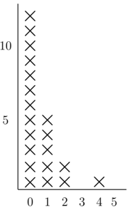
The image is a dot plot showing the frequency distribution of a dataset. The x-axis represents the values, and the y-axis represents the frequency of each value. Each 'X' represents one data point.
### Components/Axes
* **X-axis:** Values ranging from 0 to 5.
* **Y-axis:** Frequency, with markers at 5 and 10.
* **Data Points:** 'X' marks indicating the frequency of each value.
### Detailed Analysis
* **Value 0:** Frequency is approximately 11.
* **Value 1:** Frequency is approximately 4.
* **Value 2:** Frequency is approximately 3.
* **Value 3:** Frequency is 0.
* **Value 4:** Frequency is 1.
* **Value 5:** Frequency is 0.
### Key Observations
The data is heavily skewed towards the value 0, which has a significantly higher frequency than any other value. Values 3 and 5 have a frequency of zero.
### Interpretation
The dot plot indicates that the dataset is concentrated around the value 0, with a rapid decrease in frequency as the value increases. This suggests that the data is not evenly distributed and that the value 0 is a common occurrence. The absence of data points for values 3 and 5 suggests that these values are not present in the dataset.