\n
## Scatter Plot: Data Distribution
### Overview
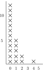
The image presents a scatter plot displaying the distribution of data points. The plot has a vertical axis representing values from 0 to 10, and a horizontal axis representing values from 0 to 5. The data is represented by 'x' markers.
### Components/Axes
* **X-axis:** Labeled with values 0, 1, 2, 3, 4, and 5.
* **Y-axis:** Labeled with values 0, 5, and 10.
* **Data Points:** Represented by 'x' markers.
### Detailed Analysis
The data points are concentrated towards the left side of the plot (lower x-values) and gradually decrease in density as the x-values increase.
* **X = 0:** Approximately 12 data points.
* **X = 1:** Approximately 7 data points.
* **X = 2:** Approximately 4 data points.
* **X = 3:** Approximately 2 data points.
* **X = 4:** Approximately 1 data point.
* **X = 5:** No data points.
The y-values for each x-value vary, but are generally clustered between 0 and 10.
### Key Observations
The data exhibits a strong negative correlation between the x and y values. As the x-value increases, the number of data points decreases significantly. The distribution is not uniform; it is heavily skewed towards lower x-values.
### Interpretation
The scatter plot suggests a decreasing frequency or probability as the x-value increases. This could represent a decay process, a diminishing return, or a negative exponential relationship. The concentration of points at x=0 indicates a high initial value or frequency, which rapidly declines as x increases. The absence of data points at x=5 suggests that the process or phenomenon being represented has effectively ceased or become negligible at that point. The plot does not provide information about the underlying cause of this relationship, only its visual representation.