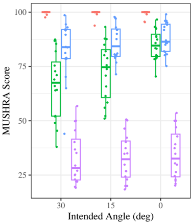
## Box Plot: MUSHRA Score vs. Intended Angle
### Overview
The image is a box plot showing the distribution of MUSHRA (MUltiple Stimuli with Hidden Reference and Anchor) scores for different intended angles (30, 15, and 0 degrees). There are four data series represented by different colored box plots: red, blue, green, and purple. Each box plot shows the median, quartiles, and outliers for the MUSHRA scores at each intended angle.
### Components/Axes
* **Y-axis:** MUSHRA Score, ranging from 0 to 100. Axis markers are present at intervals of 25 (0, 25, 50, 75, 100).
* **X-axis:** Intended Angle (deg), with categories 30, 15, and 0.
* **Data Series:** Four series are represented by box plots of different colors: red, blue, green, and purple.
### Detailed Analysis
**Red Series:**
* The red series consistently scores near 100 for all intended angles (30, 15, and 0 degrees).
* The data points are clustered tightly around 100, with minimal variance.
**Blue Series:**
* At 30 degrees, the blue series has a median around 85, with a range from approximately 75 to 95.
* At 15 degrees, the blue series has a median around 85, with a range from approximately 75 to 98.
* At 0 degrees, the blue series has a median around 85, with a range from approximately 75 to 95.
**Green Series:**
* At 30 degrees, the green series has a median around 70, with a range from approximately 40 to 80.
* At 15 degrees, the green series has a median around 75, with a range from approximately 60 to 95.
* At 0 degrees, the green series has a median around 80, with a range from approximately 70 to 95.
**Purple Series:**
* The purple series consistently scores low for all intended angles (30, 15, and 0 degrees).
* At 30 degrees, the purple series has a median around 30, with a range from approximately 20 to 50.
* At 15 degrees, the purple series has a median around 30, with a range from approximately 20 to 50.
* At 0 degrees, the purple series has a median around 30, with a range from approximately 20 to 50.
### Key Observations
* The red series consistently achieves the highest MUSHRA scores across all intended angles.
* The purple series consistently achieves the lowest MUSHRA scores across all intended angles.
* The blue series scores are consistently high across all intended angles.
* The green series scores are more variable, with a wider range of values compared to the red and blue series.
### Interpretation
The box plot visualizes the distribution of MUSHRA scores for different audio samples or conditions (represented by the red, blue, green, and purple series) at various intended angles. The red series likely represents the reference or ideal condition, as it consistently scores near 100. The purple series likely represents a degraded or undesirable condition, as it consistently scores low. The blue and green series represent intermediate conditions, with the green series showing more variability in perceived quality. The intended angle does not appear to have a significant impact on the relative performance of the different series, as their relative rankings remain consistent across all angles.