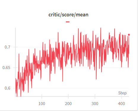
## Line Chart: Critic Score Mean Over Training Steps
### Overview
The image displays a line chart tracking a metric labeled "critic/score/mean" over a series of training steps. The chart shows a single, highly volatile data series with a clear overall upward trend. The visualization appears to be a training progress plot, likely from a machine learning or reinforcement learning context, where the "critic" component's average score is being monitored.
### Components/Axes
* **Chart Title:** "critic/score/mean" (centered at the top).
* **Legend:** A single entry consisting of a short red line segment followed by the text "critic/score/mean". It is positioned directly below the main title.
* **X-Axis (Horizontal):**
* **Label:** "Step" (positioned at the bottom-right corner of the axis).
* **Scale:** Linear scale from approximately 0 to just over 400.
* **Major Tick Marks:** Labeled at 100, 200, 300, and 400.
* **Y-Axis (Vertical):**
* **Label:** No explicit axis title is present. The values represent the "critic/score/mean".
* **Scale:** Linear scale from approximately 0.58 to 0.76.
* **Major Tick Marks:** Labeled at 0.6, 0.65, and 0.7.
* **Data Series:** A single, continuous red line plotting the value of "critic/score/mean" against the step number.
### Detailed Analysis
* **Trend Verification:** The red line exhibits a strong, positive (upward) trend from left to right. It begins at a low point, rises steeply initially, continues to climb with significant noise, and appears to plateau or slightly decline in the final segment.
* **Data Point Extraction (Approximate):**
* **Start (Step ~0):** The line begins at its lowest point, approximately **0.58**.
* **Early Phase (Steps 0-100):** Rapid increase with high volatility. By step 100, the value fluctuates around **0.65**.
* **Mid Phase (Steps 100-300):** Continued upward trend with persistent high-frequency noise. The line frequently spikes above 0.7 and dips below 0.65. The central tendency rises from ~0.65 to ~0.71.
* **Late Phase (Steps 300-400+):** The trend appears to stabilize or slightly decrease. The line oscillates heavily between approximately **0.68 and 0.74**, with a final visible point near step 420 at approximately **0.73**.
* **Peak Value:** The highest visible spike occurs around step 250, reaching approximately **0.75**.
* **Volatility:** The data is extremely noisy throughout, with step-to-step variations often exceeding 0.05 units.
### Key Observations
1. **Consistent Upward Trajectory:** Despite extreme noise, the underlying mean value of the critic score increases by roughly **0.15 units** (from ~0.58 to ~0.73) over the 400+ steps shown.
2. **High Volatility:** The signal is characterized by constant, large-magnitude fluctuations. This suggests the metric is measured on a per-step or small-batch basis and is inherently noisy.
3. **Potential Plateau:** After step 300, the clear upward momentum diminishes. The data oscillates within a band, suggesting the learning process may be approaching a local optimum or experiencing diminishing returns.
4. **No Anomalous Breaks:** The line is continuous with no gaps or sudden, discontinuous jumps that would indicate a system reset or error.
### Interpretation
This chart likely visualizes the training progress of a critic network in a reinforcement learning algorithm (e.g., Actor-Critic methods). The "critic/score/mean" probably represents the average estimated value (or advantage) of states encountered during training.
* **What the Data Suggests:** The critic is successfully learning to evaluate states more favorably over time, as indicated by the rising mean score. This is a desired outcome, showing the agent's value function is improving.
* **Relationship Between Elements:** The "Step" axis represents training iterations or environment interactions. The rising red line directly correlates increased training experience with improved critic performance.
* **Notable Patterns & Anomalies:**
* The **high volatility** is the most prominent feature. This is not necessarily an anomaly but a characteristic of the training signal. It implies that while the *average* critic evaluation is improving, its *instantaneous* evaluations vary wildly, which is common in stochastic environments.
* The **plateau after step 300** is a critical observation. It may indicate that the critic's learning has slowed, which could be due to the actor also improving (making evaluation harder), the learning rate being too high, or the approach to a performance ceiling. Monitoring beyond step 400 would be necessary to confirm if this is a true plateau or a temporary pause.
* The **starting value (~0.58)** provides a baseline for the critic's initial, untrained performance.
In summary, the chart documents a noisy but successful learning curve for a critic model, showing clear progress over 400+ training steps with signs of potential convergence in the later stages.