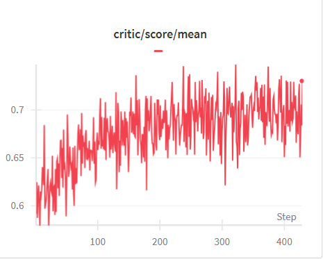
## Line Chart: Critic Score Mean vs. Step
### Overview
The image is a line chart displaying the mean critic score over a series of steps. The chart shows the trend of the critic's performance, with the x-axis representing the step number and the y-axis representing the critic score mean. The line is colored red.
### Components/Axes
* **Title:** critic/score/mean
* **X-axis:**
* Label: Step
* Scale: 0 to 400, with markers at approximately 100, 200, 300, and 400.
* **Y-axis:**
* Scale: 0.6 to 0.7, with markers at 0.6, 0.65, and 0.7.
* **Legend:** A short red horizontal line is present next to the title, indicating the color of the data series.
### Detailed Analysis
* **Data Series:** The red line represents the "critic/score/mean".
* **Trend:** The line generally slopes upward from approximately step 0 to step 400. The line fluctuates significantly, but the overall trend is positive.
* **Values:**
* At step 0, the value is approximately 0.58.
* At step 100, the value fluctuates around 0.65.
* At step 200, the value fluctuates around 0.68.
* At step 300, the value fluctuates around 0.67.
* At step 400, the value is approximately 0.72.
### Key Observations
* The critic score mean generally increases over the steps, indicating an improvement in the critic's performance.
* There are significant fluctuations in the critic score mean, suggesting variability in the critic's performance at different steps.
* The most significant increase in the critic score mean occurs in the early steps (0-100).
### Interpretation
The chart suggests that the critic's performance improves over time, as indicated by the upward trend of the critic score mean. The fluctuations in the score may be due to the inherent variability in the training process or the complexity of the task. The initial rapid increase in the score suggests that the critic learns quickly in the early stages of training. The data demonstrates the learning process of the critic, showing how its performance evolves over a series of steps.