# Technical Document Extraction: Coverage Rate Analysis
## Image Description
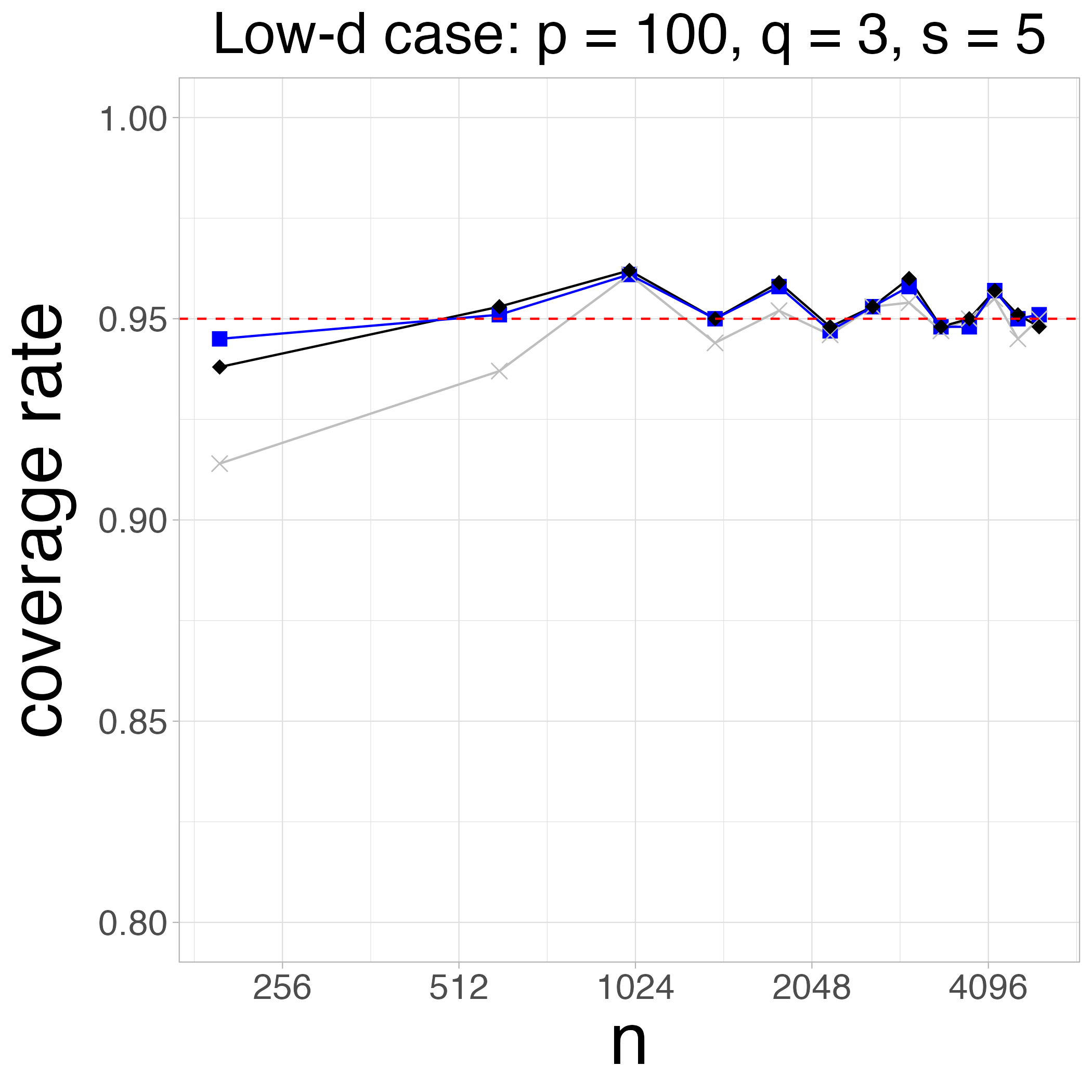
The image is a line chart titled **"Low-d case: p = 100, q = 3, s = 5"**. It visualizes the relationship between the variable **n** (x-axis) and **coverage rate** (y-axis). The chart includes three data series and a reference line.
---
## Key Components
### 1. **Title**
- **Text**: "Low-d case: p = 100, q = 3, s = 5"
- **Purpose**: Specifies parameters for the low-dimensional case analysis.
### 2. **Axes**
- **X-axis (Horizontal)**:
- **Label**: "n"
- **Range**: 256 to 4096 (logarithmic scale implied by spacing).
- **Y-axis (Vertical)**:
- **Label**: "coverage rate"
- **Range**: 0.80 to 1.00 (increments of 0.05).
### 3. **Legend**
- **Location**: Top-right corner (spatial grounding: [x, y] = [top-right]).
- **Entries**:
- **Blue squares**: Represent one data series.
- **Black diamonds**: Represent another data series.
- **Gray crosses**: Represent a third data series.
- **Reference Line**:
- **Color**: Red dashed line.
- **Value**: Fixed at **0.95** (y-axis).
---
## Data Series Analysis
### 1. **Blue Squares**
- **Trend**:
- Starts at **0.94** (n=256).
- Peaks at **0.96** (n=1024).
- Fluctuates slightly downward but stabilizes near **0.95** for larger n.
- **Key Points**:
- n=256: 0.94
- n=512: 0.95
- n=1024: 0.96
- n=2048: 0.95
- n=4096: 0.95
### 2. **Black Diamonds**
- **Trend**:
- Starts at **0.93** (n=256).
- Peaks at **0.96** (n=1024).
- Dips slightly to **0.94** (n=2048) before recovering to **0.95** (n=4096).
- **Key Points**:
- n=256: 0.93
- n=512: 0.95
- n=1024: 0.96
- n=2048: 0.94
- n=4096: 0.95
### 3. **Gray Crosses**
- **Trend**:
- Starts at **0.91** (n=256).
- Rises to **0.95** (n=1024).
- Declines to **0.94** (n=2048) and stabilizes at **0.94** (n=4096).
- **Key Points**:
- n=256: 0.91
- n=512: 0.94
- n=1024: 0.95
- n=2048: 0.94
- n=4096: 0.94
---
## Reference Line
- **Red dashed line** at **0.95** (y-axis).
- **Purpose**: Indicates a target or threshold for coverage rate.
---
## Spatial Grounding
- **Legend Position**: Top-right corner (confirmed via visual inspection).
- **Data Series Alignment**:
- Blue squares align with the blue legend entry.
- Black diamonds align with the black legend entry.
- Gray crosses align with the gray legend entry.
---
## Observations
1. All three data series converge near the **0.95** threshold (red dashed line) for larger values of **n**.
2. The **blue squares** and **black diamonds** exhibit similar peak behavior at **n=1024**, while the **gray crosses** show a delayed peak.
3. The **gray crosses** start with the lowest coverage rate but improve significantly by **n=1024**.
---
## Notes
- No additional languages or non-English text are present.
- The chart does not include a data table; all information is derived from the plotted lines and markers.
- The logarithmic scale of the x-axis (n) is inferred from the spacing between values (e.g., 256, 512, 1024, 2048, 4096).