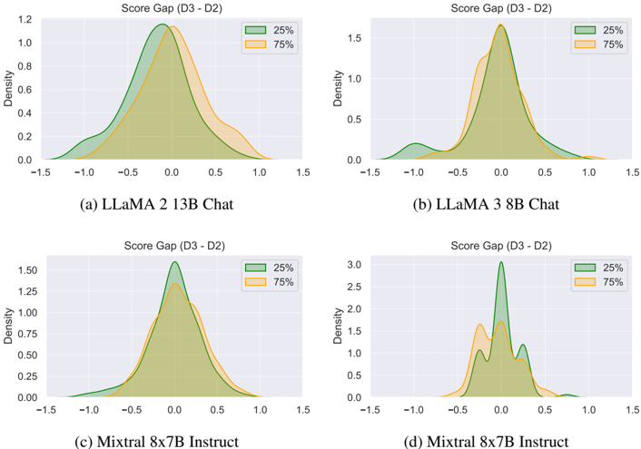
## Density Plots: Model Score Gap Distributions
### Overview
The image contains four density plots, each displaying the distribution of the score gap (D3 - D2) for different language models. The plots compare the distributions at the 25th and 75th percentiles. The models analyzed are LLaMA 2 13B Chat, LLaMA 3 8B Chat, and Mixtral 8x7B Instruct.
### Components/Axes
Each plot has the following components:
* **Title:** "Score Gap (D3 - D2)"
* **X-axis:** Represents the score gap (D3 - D2), ranging from -1.5 to 1.5.
* **Y-axis:** Represents the density, ranging from 0 to a maximum value that varies between plots (1.2, 1.5, or 3.0).
* **Legend:** Located in the top-right corner of each plot, indicating the percentile represented by each color:
* Green: 25%
* Orange: 75%
* **Model Name:** Located below each plot, indicating the language model being analyzed.
### Detailed Analysis
**Plot (a): LLaMA 2 13B Chat**
* **25% (Green):** The density curve peaks around -0.1, with a relatively symmetrical distribution.
* **75% (Orange):** The density curve peaks around 0, slightly shifted to the right compared to the 25% curve.
* **Density Range:** 0 to 1.2
**Plot (b): LLaMA 3 8B Chat**
* **25% (Green):** The density curve peaks around -0.1, with a relatively symmetrical distribution.
* **75% (Orange):** The density curve peaks around 0, slightly shifted to the right compared to the 25% curve.
* **Density Range:** 0 to 1.5
**Plot (c): Mixtral 8x7B Instruct**
* **25% (Green):** The density curve peaks around 0, with a relatively symmetrical distribution.
* **75% (Orange):** The density curve peaks around 0.1, slightly shifted to the right compared to the 25% curve.
* **Density Range:** 0 to 1.5
**Plot (d): Mixtral 8x7B Instruct**
* **25% (Green):** The density curve has two peaks, one around -0.2 and another around 0.1.
* **75% (Orange):** The density curve peaks around 0.1, with a less pronounced secondary peak.
* **Density Range:** 0 to 3.0
### Key Observations
* For LLaMA 2 13B Chat and LLaMA 3 8B Chat, the 75th percentile score gap distribution is shifted slightly to the right compared to the 25th percentile.
* For Mixtral 8x7B Instruct, the 25th percentile distribution shows a bimodal shape, while the 75th percentile distribution is more unimodal.
* The density values for Mixtral 8x7B Instruct are higher than those for the LLaMA models, indicating a more concentrated distribution of score gaps.
### Interpretation
The density plots illustrate the distribution of score gaps (D3 - D2) for different language models at the 25th and 75th percentiles. The shift in the 75th percentile distribution towards positive values for LLaMA models suggests that, at higher percentiles, the models tend to have a larger positive score gap. The bimodal distribution observed in the 25th percentile for Mixtral 8x7B Instruct indicates that there are two distinct clusters of score gaps at the lower percentile. The higher density values for Mixtral 8x7B Instruct suggest that its score gaps are more tightly clustered around the mean compared to the LLaMA models.