TECHNICAL ASSET FINGERPRINT
761fb3562b3918473f0b42c8
Click to view fullscreen
Press ESC or click to close
FOUND IN PAPERS
EXPERT: healer-alpha-free VERSION 1
RUNTIME: free/openrouter/healer-alpha
INTEL_VERIFIED
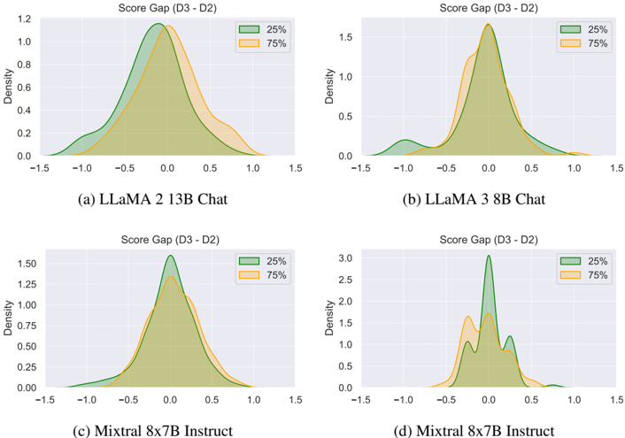
## Density Plots: Score Gap (D3 - D2) for Language Models
### Overview
The image displays four density plots arranged in a 2x2 grid. Each plot visualizes the distribution of a "Score Gap (D3 - D2)" for a specific large language model (LLM). The plots compare two distributions within each model, labeled "25%" and "75%", which likely represent different quantiles or performance tiers of the model's outputs. The overall purpose is to analyze the consistency and shift in model performance between two evaluation points or datasets (D2 and D3).
### Components/Axes
* **Common Title (per subplot):** "Score Gap (D3 - D2)"
* **X-Axis:** Labeled with numerical values representing the score gap. The scale ranges from approximately -1.5 to 1.5 across all plots, with major tick marks at -1.5, -1.0, -0.5, 0.0, 0.5, 1.0, and 1.5.
* **Y-Axis:** Labeled "Density". The scale varies per plot to accommodate the peak density of the distributions.
* **Legend:** Located in the top-right corner of each subplot. It contains two entries:
* A green-filled box labeled "25%"
* An orange-filled box labeled "75%"
* **Subplot Labels:** Each plot has a caption below it:
* (a) LLaMA 2 13B Chat
* (b) LLaMA 3 8B Chat
* (c) Mixtral 8x7B Instruct
* (d) Mixtral 8x7B Instruct
### Detailed Analysis
**Plot (a) LLaMA 2 13B Chat:**
* **Y-Axis Range:** 0.0 to 1.2.
* **25% Distribution (Green):** A unimodal, roughly symmetric distribution centered slightly below 0.0 (peak density ~1.2). The distribution spans from approximately -1.25 to +1.25.
* **75% Distribution (Orange):** Also unimodal and symmetric, but its peak is centered slightly above 0.0 (peak density ~1.1). It is slightly narrower than the 25% distribution, spanning from about -1.0 to +1.0.
* **Trend:** Both distributions are centered near zero, indicating that for most samples, the score change from D2 to D3 is minimal. The 75% distribution is shifted slightly to the right of the 25% distribution.
**Plot (b) LLaMA 3 8B Chat:**
* **Y-Axis Range:** 0.0 to 1.5.
* **25% Distribution (Green):** Primarily unimodal with a sharp peak centered very close to 0.0 (peak density ~1.6). It has a noticeable secondary, smaller mode (bump) centered around -0.75. The main body spans from -0.5 to +0.5, with tails extending to -1.5 and +1.0.
* **75% Distribution (Orange):** A sharp, unimodal distribution centered at 0.0 (peak density ~1.5). It is narrower than the 25% distribution, with most density between -0.25 and +0.25.
* **Trend:** The 75% distribution is highly concentrated at zero, suggesting very consistent performance for this tier. The 25% distribution shows more variance and a subgroup of samples where performance decreased (negative gap).
**Plot (c) Mixtral 8x7B Instruct:**
* **Y-Axis Range:** 0.0 to 1.50.
* **25% Distribution (Green):** A unimodal, symmetric distribution centered at 0.0 (peak density ~1.55). It spans from approximately -1.0 to +1.0.
* **75% Distribution (Orange):** A unimodal, symmetric distribution also centered at 0.0 (peak density ~1.35). It is slightly wider than the 25% distribution, spanning from about -1.25 to +1.25.
* **Trend:** Both distributions are nearly perfectly centered at zero with similar shapes, indicating highly consistent performance across the two tiers, with no systematic shift between D2 and D3.
**Plot (d) Mixtral 8x7B Instruct:**
* **Y-Axis Range:** 0.0 to 3.0.
* **25% Distribution (Green):** A complex, multimodal distribution. The highest peak is at 0.0 (density ~3.0). There are distinct secondary peaks at approximately -0.25 and +0.25, and a smaller bump around -0.5. The distribution spans from -0.75 to +0.75.
* **75% Distribution (Orange):** A broader, multimodal distribution. Its highest peak is slightly below 0.0 (density ~1.7). Other notable peaks are around -0.5 and +0.1. It spans from -0.75 to +0.5.
* **Trend:** This plot shows the most complex behavior. Both distributions are multimodal, suggesting distinct clusters of performance changes. The 25% tier has a very strong central tendency at zero but with clear symmetric side modes. The 75% tier is more dispersed with a slight negative bias.
### Key Observations
1. **Centering at Zero:** In all plots, the bulk of the density for both distributions is centered around a score gap of 0.0, indicating that for the majority of cases, the model's performance score did not change significantly between evaluations D2 and D3.
2. **Model Comparison:** LLaMA 3 8B Chat (b) shows the tightest clustering around zero for its 75% distribution, suggesting high consistency for its better-performing outputs. Mixtral 8x7B Instruct (c) shows the most symmetric and similar distributions between its 25% and 75% tiers.
3. **Multimodality:** Plot (d) for Mixtral 8x7B Instruct is an outlier, displaying clear multimodal distributions. This suggests the presence of distinct subgroups within the model's outputs that experienced different types of score changes (e.g., some improved, some worsened, some stayed the same).
4. **Distribution Width:** The 25% distributions (green) are generally wider than the 75% distributions (orange) in plots (a) and (b), indicating more variance in performance change for the lower-performing tier of outputs.
### Interpretation
The data suggests that these language models are generally stable between the two evaluation points (D2 and D3), as evidenced by the central tendency of score gaps near zero. However, the nature of this stability varies:
* **LLaMA 2 13B Chat** shows a slight, systematic positive shift for its 75% tier, hinting at a minor improvement for its better outputs.
* **LLaMA 3 8B Chat** demonstrates excellent consistency for its top-tier (75%) outputs but reveals a subset of lower-tier (25%) outputs that degraded significantly (the negative bump).
* **Mixtral 8x7B Instruct (c)** exhibits near-perfect stability with no bias, making it the most consistent model in this comparison.
* **Mixtral 8x7B Instruct (d)** presents a more complex scenario. The multimodal distributions could indicate that the model's performance is sensitive to specific types of prompts or data in D3, causing it to cluster into distinct "improved," "unchanged," and "worsened" groups. This warrants further investigation into the characteristics of the samples in each mode.
The comparison between the 25% and 75% distributions within each model provides insight into performance equity. A wider 25% distribution implies that the model's weaker outputs are less predictable in their evolution. The stark multimodality in plot (d) is the most significant anomaly, suggesting a non-uniform response to the change from D2 to D3 that is not captured by a simple average or central tendency.
DECODING INTELLIGENCE...