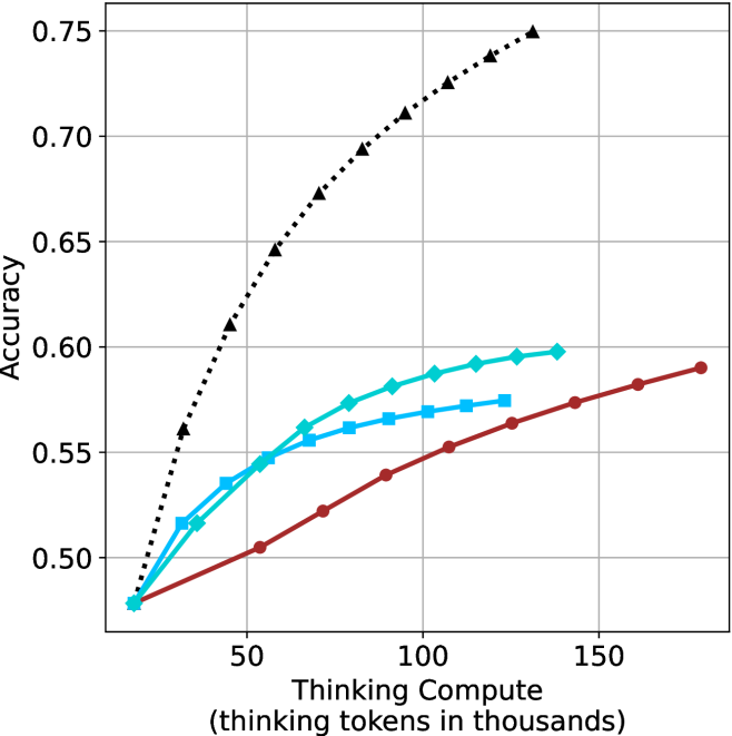
## Line Graph: Accuracy vs. Thinking Compute (Tokens in Thousands)
### Overview
The image is a line graph comparing the relationship between "Thinking Compute" (measured in thousands of tokens) and "Accuracy" across three distinct data series. The graph includes a dotted black line, a solid blue line, and a solid red line, with a legend in the top-right corner. The x-axis ranges from 0 to 150 (thousands of tokens), and the y-axis ranges from 0.50 to 0.75 (accuracy).
---
### Components/Axes
- **X-Axis**: "Thinking Compute (thinking tokens in thousands)"
- Scale: 0 to 150 (increments of 50)
- Position: Bottom of the graph
- **Y-Axis**: "Accuracy"
- Scale: 0.50 to 0.75 (increments of 0.05)
- Position: Left side of the graph
- **Legend**: Located in the top-right corner
- Labels:
- Black Dotted Line
- Solid Blue Line
- Solid Red Line
---
### Detailed Analysis
#### Black Dotted Line
- **Trend**: Steep upward slope from (0, 0.50) to (150, 0.75).
- **Key Points**:
- (0, 0.50)
- (50, 0.65)
- (100, 0.70)
- (150, 0.75)
#### Solid Blue Line
- **Trend**: Gradual upward slope from (0, 0.50) to (150, 0.59).
- **Key Points**:
- (0, 0.50)
- (50, 0.55)
- (100, 0.58)
- (150, 0.59)
#### Solid Red Line
- **Trend**: Slowest upward slope from (0, 0.50) to (150, 0.59).
- **Key Points**:
- (0, 0.50)
- (50, 0.52)
- (100, 0.56)
- (150, 0.59)
---
### Key Observations
1. **Black Dotted Line**:
- Demonstrates the steepest improvement in accuracy with increasing compute.
- Reaches 0.75 accuracy at 150k tokens, outperforming other lines by ~0.16.
2. **Solid Blue Line**:
- Shows moderate improvement, plateauing near 0.59 at 150k tokens.
- Outperforms the red line by ~0.03 at 150k tokens.
3. **Solid Red Line**:
- Exhibits the flattest growth, suggesting diminishing returns.
- Matches the blue line’s final accuracy (0.59) but with slower progression.
---
### Interpretation
- **Primary Insight**: Higher compute correlates with improved accuracy, but the rate of improvement varies significantly across models/methods.
- **Black Line Dominance**: The black line’s steep trajectory implies a highly efficient or optimized system, possibly leveraging advanced algorithms or hardware.
- **Blue vs. Red Lines**: The blue and red lines may represent alternative approaches (e.g., model architectures, training techniques) with similar efficiency ceilings but differing scalability.
- **Diminishing Returns**: The red line’s plateau highlights potential limits to accuracy gains without further optimization or resource allocation.
**Critical Note**: The graph does not specify the underlying systems or contexts for each line, leaving room for speculation about their real-world applications (e.g., AI training, computational linguistics). Further data on model parameters or experimental conditions would strengthen conclusions.