\n
## Diagram: Comparison of Data Distributions
### Overview
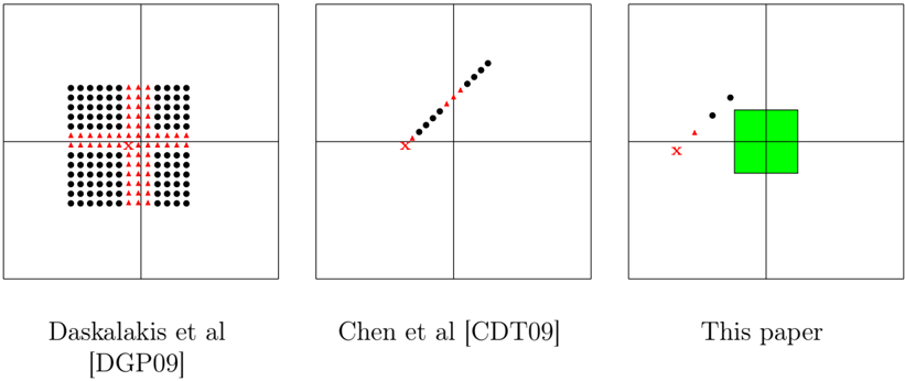
The image presents a comparative visualization of data distributions across three different approaches: Daskalakis et al. [DGP09], Chen et al. [CDT09], and "This paper". Each approach is represented by a distinct plot showing the distribution of data points. The plots are arranged horizontally, side-by-side.
### Components/Axes
Each plot has implicit x and y axes, indicated by the arrangement of data points. There are no explicit axis labels or scales. Each plot is labeled below with the corresponding author(s) and a citation in brackets.
### Detailed Analysis or Content Details
**Plot 1: Daskalakis et al. [DGP09]**
* The plot displays a grid of data points.
* There are two distinct types of points: black circles (•) and red triangles (▲).
* The black circles are densely distributed across the entire grid, forming a square pattern. Approximately 64 black circles are visible.
* The red triangles are sparsely distributed, appearing in a vertical column near the center of the grid. Approximately 10 red triangles are visible.
* The points appear to be uniformly distributed within their respective areas.
**Plot 2: Chen et al. [CDT09]**
* The plot shows a linear arrangement of black circles (•).
* The points form an upward-sloping line.
* Approximately 15 black circles are visible.
* There are two points marked with a red 'x'. One is at the lower-left of the line, and the other is at the upper-right of the line.
**Plot 3: This paper**
* The plot displays a green square with a few data points scattered around it.
* There are three black circles (•) and one red triangle (▲).
* Two black circles are positioned near the top-left corner of the square.
* One black circle is positioned near the bottom-right corner of the square.
* The red triangle is positioned near the center-left of the square.
### Key Observations
* The distribution of data points varies significantly across the three approaches.
* Daskalakis et al. shows a grid-like distribution with two distinct point types.
* Chen et al. shows a linear distribution with two outlier points.
* "This paper" shows a concentrated distribution within a square region, with a few scattered points.
* The number of data points differs substantially between the approaches.
### Interpretation
The diagram likely illustrates the results of three different algorithms or methods applied to the same problem. The different distributions of data points suggest that each approach yields different outcomes.
* **Daskalakis et al.** might represent a method that explores a large search space with some points being more significant (red triangles).
* **Chen et al.** could represent a method that converges towards a linear solution, with outliers representing deviations from the main trend.
* **"This paper"** might represent a method that focuses on a specific region of the search space (the green square), with a few points outside that region.
The diagram is a qualitative comparison, and without further context, it's difficult to determine the specific meaning of the data distributions. However, it clearly demonstrates that the three approaches differ in their behavior and outcomes. The use of different shapes and colors helps to visually distinguish the data points and highlight the differences between the approaches. The citation information suggests that these are established methods in a specific field of study.