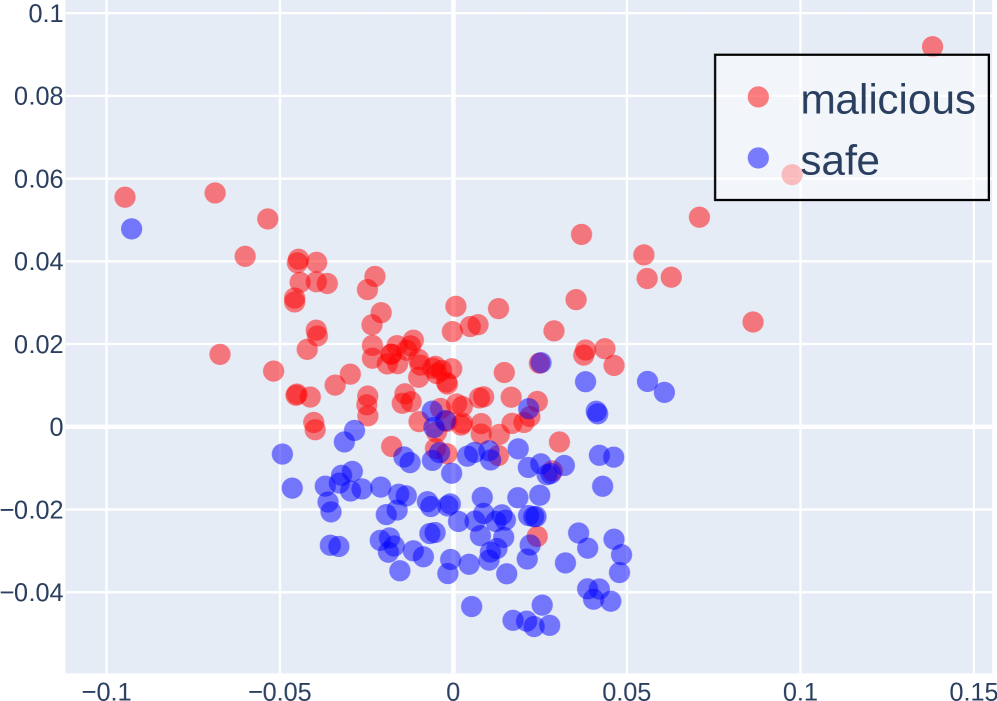
## Scatter Plot: Malicious vs. Safe Classification
### Overview
The image is a 2D scatter plot visualizing the distribution of two classes of data points, labeled "malicious" and "safe." The plot suggests a classification or clustering result, likely from a machine learning model or statistical analysis, where each point represents an instance plotted in a two-dimensional feature space. The data shows a general separation between the two classes, with significant overlap in the central region.
### Components/Axes
* **Chart Type:** Scatter Plot.
* **Legend:** Located in the top-right corner, enclosed in a black-bordered box.
* **Red Circle:** Labeled "malicious".
* **Blue Circle:** Labeled "safe".
* **X-Axis:**
* **Scale:** Linear.
* **Range:** Approximately -0.10 to 0.15.
* **Major Tick Marks:** At -0.1, -0.05, 0, 0.05, 0.1, 0.15.
* **Axis Title:** Not present.
* **Y-Axis:**
* **Scale:** Linear.
* **Range:** Approximately -0.04 to 0.10.
* **Major Tick Marks:** At -0.04, -0.02, 0, 0.02, 0.04, 0.06, 0.08, 0.1.
* **Axis Title:** Not present.
* **Grid:** A light gray grid is present, aligned with the major tick marks on both axes.
* **Data Points:** Semi-transparent circles, allowing visual assessment of density in overlapping regions.
### Detailed Analysis
* **Data Series - "malicious" (Red):**
* **Trend/Distribution:** The red points are predominantly located in the upper half of the plot (positive Y values). They form a broad, dispersed cluster that spans from the left side (X ≈ -0.1) to the far right (X ≈ 0.14). The highest density appears in the region where X is between -0.05 and 0.05, and Y is between 0 and 0.06.
* **Key Data Points (Approximate):**
* Highest Y-value: ~0.09 at X ≈ 0.14 (top-right outlier).
* Leftmost point: X ≈ -0.1, Y ≈ 0.055.
* A dense core cluster is centered around (X ≈ -0.02, Y ≈ 0.02).
* **Data Series - "safe" (Blue):**
* **Trend/Distribution:** The blue points are predominantly located in the lower half of the plot (negative Y values). They form a tighter, more concentrated cluster compared to the red series. The main cluster is centered around X ≈ 0, Y ≈ -0.02. The distribution extends from X ≈ -0.08 to X ≈ 0.06.
* **Key Data Points (Approximate):**
* Lowest Y-value: ~-0.045 at X ≈ 0.01.
* Leftmost point: X ≈ -0.08, Y ≈ 0.048 (an outlier in the upper-left).
* Rightmost point: X ≈ 0.06, Y ≈ 0.01.
* **Overlap Region:** There is a significant zone of overlap between the two classes, primarily in the central area where X is between -0.05 and 0.05, and Y is between -0.01 and 0.03. In this region, red and blue points are intermingled.
### Key Observations
1. **General Separation:** There is a clear, though imperfect, vertical separation. "Malicious" instances tend to have higher Y-axis values, while "safe" instances tend to have lower Y-axis values.
2. **Density Difference:** The "safe" (blue) cluster appears denser and more compact than the more spread-out "malicious" (red) cluster.
3. **Notable Outliers:**
* A "safe" (blue) point is located high in the upper-left quadrant (X ≈ -0.08, Y ≈ 0.048), well within the typical "malicious" region.
* A "malicious" (red) point is located at the extreme top-right (X ≈ 0.14, Y ≈ 0.09), far from the main clusters.
* A few "malicious" (red) points are found within the main "safe" cluster (e.g., near X ≈ 0.02, Y ≈ -0.03).
4. **Axis Ambiguity:** The lack of axis titles makes it impossible to know what the plotted dimensions represent (e.g., principal components, specific feature values, model outputs).
### Interpretation
This scatter plot visualizes the output of a binary classification system. The two axes represent two features or dimensions used to distinguish between "malicious" and "safe" entities (e.g., network packets, files, user behaviors).
* **What the data suggests:** The system has learned a decision boundary that is primarily oriented along the Y-axis. Entities with a high value on this Y-dimension are more likely to be classified as malicious. The X-axis provides secondary discriminatory power.
* **Relationship between elements:** The spatial separation indicates the features have predictive power. The overlap region represents the "zone of uncertainty" where the classifier may make errors (false positives or false negatives). The outliers suggest edge cases where the model's features may be insufficient or where the data is anomalous.
* **Anomalies and Implications:** The presence of "safe" points in the high-Y region and "malicious" points in the low-Y region highlights the challenge of perfect classification. These points would be misclassified by a simple linear boundary. The compactness of the "safe" cluster might indicate more consistent, normative behavior, while the dispersion of the "malicious" cluster could reflect diverse attack strategies or noisy data. To improve the model, one might investigate the outliers or engineer new features to better separate the overlapping central region.