## Scatter Plot: Malicious vs. Safe Data Points
### Overview
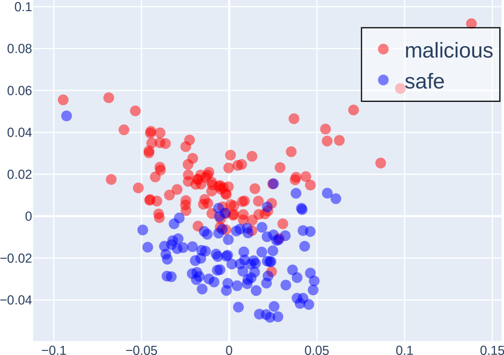
The image is a scatter plot displaying two categories of data points: "malicious" (represented in red) and "safe" (represented in blue). The plot shows the distribution of these points across a two-dimensional space, with the x-axis ranging from approximately -0.1 to 0.15 and the y-axis ranging from approximately -0.04 to 0.1. The plot suggests a partial separation between the two categories, with "malicious" points tending to cluster more towards the top and left, and "safe" points towards the bottom.
### Components/Axes
* **X-axis:** Ranges from -0.1 to 0.15, with tick marks at -0.1, -0.05, 0, 0.05, 0.1, and 0.15. The axis is unlabeled.
* **Y-axis:** Ranges from -0.04 to 0.1, with tick marks at -0.04, -0.02, 0, 0.02, 0.04, 0.06, 0.08, and 0.1. The axis is unlabeled.
* **Legend:** Located in the top-right corner, enclosed in a black rectangle.
* Red circles represent "malicious" data points.
* Blue circles represent "safe" data points.
### Detailed Analysis
* **Malicious (Red) Data Points:**
* Concentrated primarily in the upper-left quadrant.
* Range of x-values: Approximately -0.08 to 0.12.
* Range of y-values: Approximately 0 to 0.06.
* General Trend: Points are more densely packed between x=-0.05 and x=0.05, and y=0 and y=0.04.
* **Safe (Blue) Data Points:**
* Concentrated primarily in the lower-center region.
* Range of x-values: Approximately -0.1 to 0.08.
* Range of y-values: Approximately -0.04 to 0.06.
* General Trend: Points are more densely packed between x=-0.03 and x=0.03, and y=-0.03 and y=0.
### Key Observations
* There is some overlap between the "malicious" and "safe" data points, particularly around the origin (0,0).
* The "malicious" data points tend to have higher y-values compared to the "safe" data points.
* The "safe" data points tend to have lower y-values compared to the "malicious" data points.
* There are a few "malicious" points that are relatively isolated in the upper-right quadrant.
* There is one "safe" point that is relatively isolated in the upper-left quadrant.
### Interpretation
The scatter plot visually represents the distribution of "malicious" and "safe" data points in a two-dimensional feature space. The partial separation suggests that the two categories can be distinguished to some extent based on the underlying features represented by the x and y axes. However, the overlap indicates that these features alone are not sufficient for perfect classification. The clustering of "malicious" points towards higher y-values and "safe" points towards lower y-values suggests that the y-axis feature might be more discriminative than the x-axis feature. Further analysis and potentially additional features would be needed to improve the classification accuracy.