\n
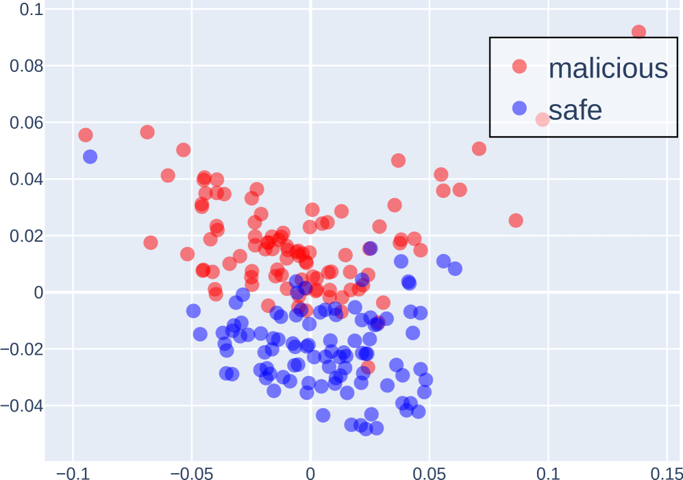
## Scatter Plot: Malicious vs. Safe Data Points
### Overview
This image presents a scatter plot visualizing the distribution of data points categorized as either "malicious" or "safe" across two dimensions. The plot appears to be attempting to differentiate between these two categories based on their coordinates in a two-dimensional space.
### Components/Axes
* **X-axis:** Ranges approximately from -0.1 to 0.15. No explicit label is provided, but it represents a numerical value.
* **Y-axis:** Ranges approximately from -0.04 to 0.1. No explicit label is provided, but it represents a numerical value.
* **Legend:** Located in the top-right corner.
* **malicious:** Represented by red circles.
* **safe:** Represented by blue circles.
### Detailed Analysis
The scatter plot displays a cluster of points for each category.
**"malicious" (Red Circles):**
The "malicious" data points are generally concentrated in the upper-right quadrant of the plot, with a noticeable spread along both axes.
* The points are distributed roughly between x = -0.08 and x = 0.12, and y = -0.02 and y = 0.08.
* There is a single outlier at approximately (0.1, 0.09).
* The density of points appears higher in the region around x = -0.03 to 0.02 and y = 0.02 to 0.04.
**"safe" (Blue Circles):**
The "safe" data points are primarily clustered in the lower-left quadrant of the plot.
* The points are distributed roughly between x = -0.1 and x = 0.07, and y = -0.04 and y = 0.04.
* The density of points appears highest in the region around x = -0.02 to 0.02 and y = -0.02 to 0.02.
* There is a slight tail extending towards positive x-values.
It is difficult to provide precise numerical values for each point without access to the underlying data. However, the visual distribution can be described.
### Key Observations
* There is a clear separation between the "malicious" and "safe" data points, suggesting that the two dimensions used in the plot are effective in distinguishing between the two categories.
* The "malicious" points tend to have higher values on both the x and y axes compared to the "safe" points.
* The outlier "malicious" point at (0.1, 0.09) may represent an unusual case or an error in the data.
* The spread of the "malicious" points is wider than that of the "safe" points, indicating greater variability within the "malicious" category.
### Interpretation
The scatter plot suggests that the two dimensions used (represented by the x and y axes) are useful features for classifying data as either "malicious" or "safe." The separation between the clusters indicates that a model trained on these features could potentially achieve high accuracy in distinguishing between the two categories. The outlier "malicious" point warrants further investigation, as it may represent a false positive or a unique type of malicious activity. The wider spread of the "malicious" points could indicate that malicious activities are more diverse than safe activities, or that the features used are less effective at capturing the nuances of malicious behavior. Without knowing what the axes represent, it is difficult to provide a more specific interpretation. However, the plot clearly demonstrates a correlation between the two dimensions and the "malicious" vs. "safe" classification.