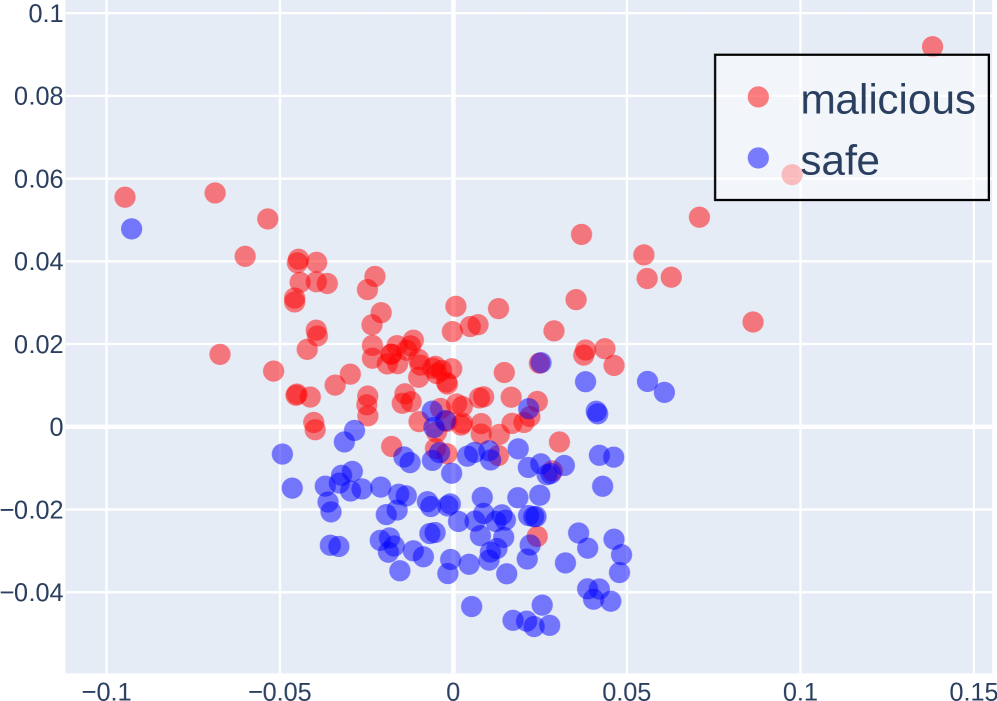
## Scatter Plot: Distribution of Malicious and Safe Data Points
### Overview
The image is a scatter plot visualizing the distribution of two categories: "malicious" (red dots) and "safe" (blue dots). The plot uses a Cartesian coordinate system with X and Y axes ranging from -0.1 to 0.15 (X-axis) and -0.04 to 0.1 (Y-axis). The legend is positioned in the top-right corner, explicitly linking red to "malicious" and blue to "safe."
### Components/Axes
- **X-axis**: Labeled "X" with no units, spanning approximately -0.1 to 0.15.
- **Y-axis**: Labeled "Y" with no units, spanning approximately -0.04 to 0.1.
- **Legend**: Located in the top-right corner, with red circles labeled "malicious" and blue circles labeled "safe."
- **Data Points**:
- **Malicious (red)**: ~40-50 points, predominantly clustered in the upper half of the plot (Y > 0) and spread across the X-axis.
- **Safe (blue)**: ~30-40 points, concentrated in the lower half (Y < 0) but with some overlap in the middle region (Y ≈ 0).
### Detailed Analysis
- **Axis Labels**:
- X-axis: "X" (no units, approximate range: -0.1 to 0.15).
- Y-axis: "Y" (no units, approximate range: -0.04 to 0.1).
- **Legend**:
- Red = "malicious" (top-right corner).
- Blue = "safe" (top-right corner).
- **Data Point Distribution**:
- **Malicious (red)**:
- Highest Y-value: ~0.09 (X ≈ 0.14).
- Lowest Y-value: ~0.0 (X ≈ -0.05 to 0.05).
- Clustered densely around X ≈ 0 and Y ≈ 0.02–0.06.
- **Safe (blue)**:
- Highest Y-value: ~0.05 (X ≈ -0.08).
- Lowest Y-value: ~-0.04 (X ≈ 0 to 0.05).
- Clustered densely around X ≈ 0 and Y ≈ -0.02 to 0.0.
### Key Observations
1. **Malicious vs. Safe Separation**:
- Malicious points are predominantly in the upper half (Y > 0), while safe points are in the lower half (Y < 0).
- Overlap occurs in the middle region (Y ≈ 0), suggesting ambiguity in some cases.
2. **Outliers**:
- A single red point at (X ≈ 0.14, Y ≈ 0.09) is the farthest right and highest in the plot.
- A blue point at (X ≈ -0.08, Y ≈ 0.05) is the highest safe point.
3. **Density**:
- Malicious points are more densely packed in the central region (X ≈ 0, Y ≈ 0.02–0.06).
- Safe points are more spread out in the lower half, with fewer points near the origin.
### Interpretation
The plot suggests a clear distinction between "malicious" and "safe" categories based on the Y-axis metric, which could represent a risk score, anomaly detection value, or classification confidence. The separation implies that higher Y-values are associated with malicious instances, while lower Y-values correlate with safe instances. However, the overlap in the middle region indicates potential ambiguity or misclassification in some data points. The spread of red points toward the upper-right corner (X ≈ 0.14, Y ≈ 0.09) may highlight extreme or high-risk cases, while the blue points in the lower-left (X ≈ -0.08, Y ≈ 0.05) could represent edge cases or anomalies within the safe category. The lack of axis units limits quantitative interpretation, but the relative positioning of points provides qualitative insights into the data distribution.