\n
## Diagram: Traffic Light and Layered Visualizations
### Overview
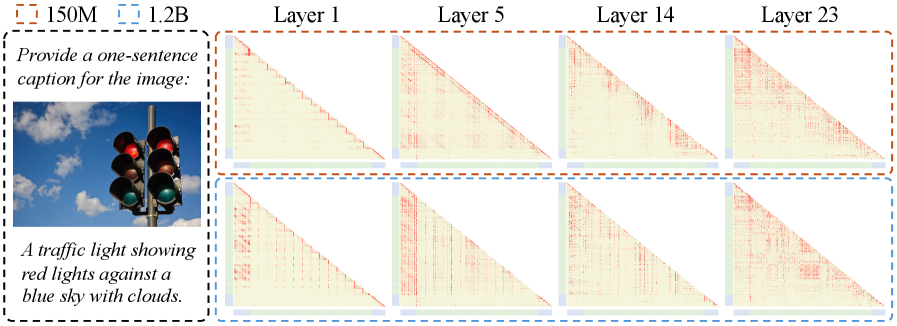
The image presents a visual comparison of a photograph of a traffic light with four layered visualizations, likely representing some form of data processing or transformation applied to the image. The visualizations appear to show a pattern of diagonal lines with varying degrees of intensity or detail across different layers. Numerical values are provided in the top-left corner.
### Components/Axes
* **Photograph:** A color photograph of a traffic light with red lights illuminated against a blue sky with clouds.
* **Layer Labels:** "Layer 1", "Layer 5", "Layer 14", "Layer 23" are positioned horizontally above each visualization.
* **Visualization Panels:** Four panels, arranged in a 2x2 grid, each displaying a visualization. Each panel contains a diagonal pattern.
* **Numerical Values:** "150M" and "1.2B" are displayed in the top-left corner, enclosed in a dashed box.
* **Caption Request:** A text box prompts for a one-sentence caption.
* **Example Caption:** "A traffic light showing red lights against a blue sky with clouds."
### Detailed Analysis or Content Details
The visualizations show a repeating diagonal pattern. The intensity of the pattern changes across the layers.
* **Layer 1:** The visualization is very faint, with the diagonal lines barely visible. The background color is a very pale yellow.
* **Layer 5:** The diagonal lines are more pronounced than in Layer 1, but still relatively faint. The background color is a pale yellow.
* **Layer 14:** The diagonal lines are significantly more visible and have a reddish hue. The background color is a pale yellow.
* **Layer 23:** The diagonal lines are the most prominent and have a strong reddish hue. The background color is a pale yellow.
The diagonal lines in all layers appear to run from the top-left to the bottom-right of each panel. The pattern seems consistent in direction but varies in intensity.
### Key Observations
* The intensity of the diagonal pattern increases with layer number.
* The color of the pattern shifts from faint to reddish as the layer number increases.
* The numerical values "150M" and "1.2B" are present but their relationship to the visualizations is unclear without further context.
### Interpretation
The image likely demonstrates a process where data is progressively transformed or filtered through multiple layers. The traffic light photograph serves as the initial input, and the subsequent layers represent stages of processing. The increasing intensity and color change of the diagonal pattern suggest that certain features or signals are being amplified or highlighted as the data moves through the layers.
The numerical values "150M" and "1.2B" could represent data sizes, processing times, or other relevant metrics associated with the layers. Without additional information, it's difficult to determine their precise meaning. The prompt for a caption suggests the image is intended to be self-explanatory, but the layered visualizations require further context to fully understand their purpose and significance. The diagonal pattern could represent edge detection, feature extraction, or some other form of image processing. The increasing intensity might indicate the accumulation of these features across layers.