\n
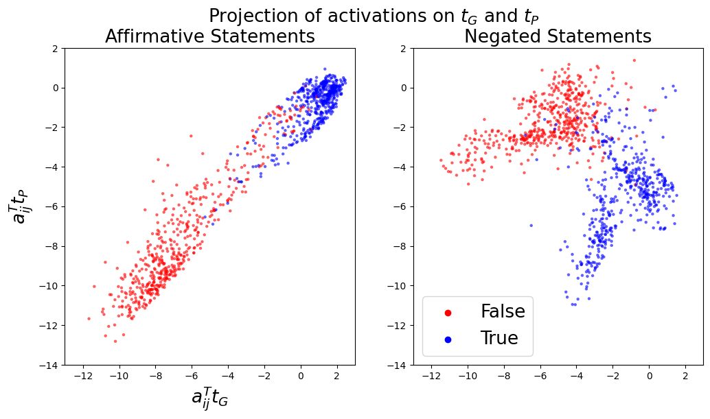
## Scatter Plots: Projection of activations on τG and τP
### Overview
The image presents two scatter plots, side-by-side, visualizing the projection of activations onto two axes, τG and τP. The left plot displays data for "Affirmative Statements," while the right plot shows data for "Negated Statements." Each point in the scatter plots represents a data point labeled as either "True" or "False."
### Components/Axes
* **Title:** "Projection of activations on τG and τP" (centered at the top)
* **X-axis Label (both plots):** a<sub>ij</sub>τ<sub>G</sub> (ranging approximately from -12 to 2)
* **Y-axis Label (both plots):** a<sub>ij</sub>τ<sub>P</sub> (ranging approximately from -14 to 2)
* **Left Plot Title:** "Affirmative Statements" (top-left)
* **Right Plot Title:** "Negated Statements" (top-right)
* **Legend (bottom-right, shared between plots):**
* Red circles: False
* Blue circles: True
### Detailed Analysis or Content Details
**Left Plot: Affirmative Statements**
* **Trend:** The data points generally form a diagonal band. The points transition from lower-left to upper-right.
* **False (Red):** Points are concentrated in the lower-left quadrant, with x-values ranging from approximately -11 to -2 and y-values ranging from approximately -13 to -4. There is a slight upward trend within the False points.
* **True (Blue):** Points are concentrated in the upper-right quadrant, with x-values ranging from approximately -3 to 2 and y-values ranging from approximately -3 to 1. There is a slight upward trend within the True points.
**Right Plot: Negated Statements**
* **Trend:** Similar to the left plot, the data points form a diagonal band, transitioning from lower-left to upper-right.
* **False (Red):** Points are concentrated in the lower-left quadrant, with x-values ranging from approximately -10 to -2 and y-values ranging from approximately -13 to -4. There is a slight upward trend within the False points.
* **True (Blue):** Points are concentrated in the upper-right quadrant, with x-values ranging from approximately -4 to 2 and y-values ranging from approximately -4 to 1. There is a slight upward trend within the True points.
### Key Observations
* Both plots exhibit a clear separation between "True" and "False" data points along the diagonal.
* The distribution of points appears somewhat elongated along the diagonal in both plots.
* The range of x and y values is similar for both Affirmative and Negated statements.
* The density of points appears higher for "True" statements compared to "False" statements in both plots.
### Interpretation
The plots suggest that the projections of activations onto τG and τP can effectively differentiate between "True" and "False" statements, both in their affirmative and negated forms. The diagonal arrangement indicates a correlation between the activations on these two axes. The separation between the "True" and "False" clusters suggests that the projection space is sensitive to the truth value of the statements.
The similarity between the two plots (Affirmative vs. Negated) indicates that the underlying mechanism for distinguishing truth values is consistent, even when statements are negated. The slight upward trend within each class (True/False) suggests a positive correlation between activations on τG and τP. The higher density of "True" points might indicate a bias in the dataset or a stronger activation pattern for true statements.
The axes τG and τP likely represent some latent features or dimensions learned by a model, and their projection reveals a structure that aligns with the semantic property of truthfulness. Further investigation would be needed to understand the specific meaning of these axes and the underlying model's representation of truth.