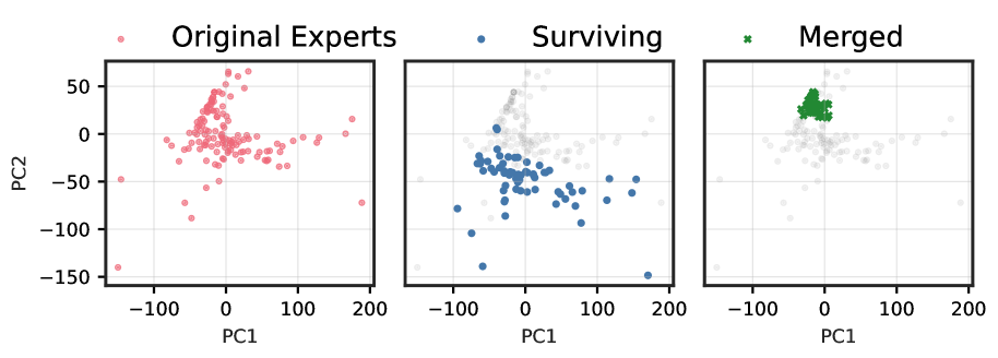
This image contains three scatter plots arranged horizontally, sharing common axis labels and ranges, and a single legend at the top.
**Overall Description:**
The image presents a comparison of three different sets of data points, likely representing different stages or selections of "experts," projected onto two principal components, PC1 and PC2. Each subplot visualizes a different category of data points, with the latter two subplots also showing the full original distribution in a faded background.
**Legend (Spatial Grounding: Top of the image, horizontally centered):**
* **Original Experts**: Represented by light red/pink circular markers (•).
* **Surviving**: Represented by blue circular markers (•).
* **Merged**: Represented by green asterisk markers (*).
**Common Chart Elements:**
* **X-axis Label**: PC1
* **Y-axis Label**: PC2
* **X-axis Range**: From -150 to 200, with major tick marks at -100, 0, 100, and 200.
* **Y-axis Range**: From -150 to 50, with major tick marks at -150, -100, -50, 0, and 50.
* **Grid**: A light grey grid is present in the background of all plots, aligning with the major tick marks.
---
**Subplot 1: Original Experts (Leftmost Plot)**
* **Data Series**: "Original Experts" (light red/pink circular markers).
* **Trend/Distribution**: The data points are broadly distributed across the plot area. They form a somewhat dispersed, elongated cluster that extends from approximately PC1 = -100 to 150 and PC2 = -150 to 50. There is a denser concentration of points around the origin (PC1=0, PC2=0), with a visible spread towards positive PC1 values and negative PC2 values, forming a loose, somewhat 'C'-shaped or 'U'-shaped pattern opening towards the left. Some outliers are present, for example, near PC1=-150, PC2=-150 and PC1=150, PC2=20.
---
**Subplot 2: Surviving (Middle Plot)**
* **Data Series**: "Surviving" (blue circular markers).
* **Background Data**: The full distribution of "Original Experts" is shown in the background as faded light grey circular markers.
* **Trend/Distribution**: The blue "Surviving" data points form a distinct, more concentrated cluster compared to the overall "Original Experts" distribution. This cluster is primarily located in the lower-left to central-left region of the plot, roughly spanning PC1 from -75 to 100 and PC2 from -150 to 0. The densest part of this cluster appears to be centered around PC1 = 0 and PC2 = -50. This suggests that "Surviving" points represent a subset of the "Original Experts" that are concentrated in a specific region of the PC1-PC2 space, generally characterized by negative PC2 values and a mix of negative and positive PC1 values.
---
**Subplot 3: Merged (Rightmost Plot)**
* **Data Series**: "Merged" (green asterisk markers).
* **Background Data**: The full distribution of "Original Experts" is shown in the background as faded light grey circular markers.
* **Trend/Distribution**: The green "Merged" data points form a very tight and dense cluster. This cluster is located in the upper-left quadrant of the plot, specifically concentrated around PC1 from -25 to 25 and PC2 from 25 to 50. This indicates that the "Merged" points represent a highly localized and compact group within the overall data space, distinct from the "Surviving" cluster and occupying a different region compared to the broader "Original Experts" distribution.