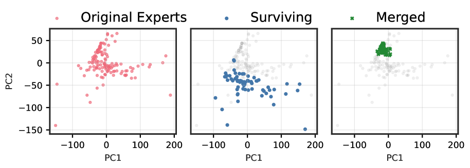
## Technical Description of Scatter Plots
This image presents three side-by-side scatter plots, all sharing the same axes and grid. The plots illustrate the distribution of data points in a two-dimensional principal component space defined by PC1 and PC2.
### Common Elements
* **Y-axis:** Labeled "PC2", with major tick marks and labels at -150, -100, -50, 0, and 50.
* **X-axis:** Labeled "PC1", with major tick marks and labels at -100, 0, 100, and 200.
* **Grid:** A light gray grid is overlaid on all three plots, corresponding to the major tick marks.
### Plot 1: Original Experts (Left)
* **Title:** "Original Experts"
* **Legend:** A pink circle marker is associated with this title.
* **Data Distribution:** The plot displays a large number of pink circle markers. The points are widely scattered across the PC1-PC2 plane. There is a concentration of points around the origin (PC1=0, PC2=0), with a spread extending approximately from PC1=-150 to PC1=200 and from PC2=-150 to PC2=70.
### Plot 2: Surviving (Middle)
* **Title:** "Surviving"
* **Legend:** A blue circle marker is associated with this title.
* **Data Distribution:** This plot shows a subset of the points from the "Original Experts" plot, represented by blue circle markers. These "Surviving" points are primarily located in the lower half of the plot (PC2 < 0), with a few points slightly above PC2=0. They are spread along the PC1 axis, roughly from -100 to 180. Faint gray points in the background represent the complete set of "Original Experts" data for context.
### Plot 3: Merged (Right)
* **Title:** "Merged"
* **Legend:** A green 'x' marker is associated with this title.
* **Data Distribution:** This plot displays a distinct cluster of green 'x' markers. These "Merged" points are tightly grouped in the upper-left quadrant of the plot, approximately centered around PC1=-20 and PC2=30. Similar to the middle plot, faint gray points representing the "Original Experts" data are visible in the background.