\n
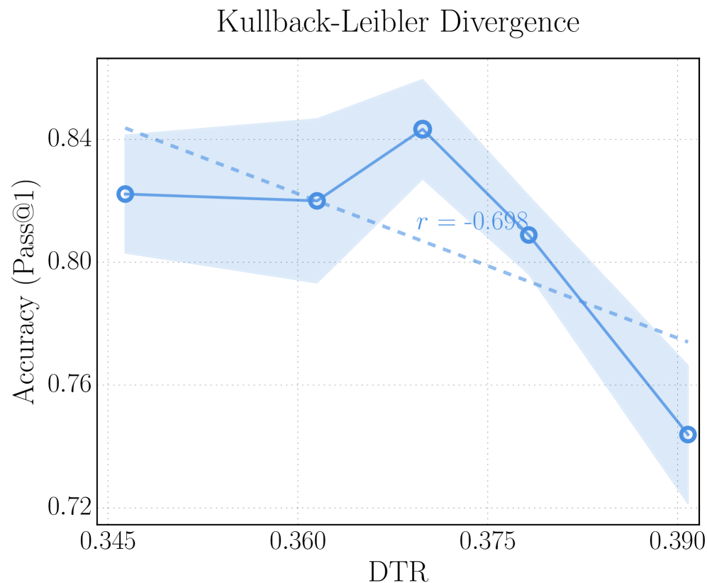
## Line Chart: Kullback-Leibler Divergence
### Overview
This image presents a line chart illustrating the relationship between DTR (likely a measure of diversity or distribution) and Accuracy (Pass@1). The chart includes a central line representing the trend, a shaded region indicating the variance or confidence interval, and a correlation coefficient.
### Components/Axes
* **Title:** Kullback-Leibler Divergence
* **X-axis:** DTR, ranging from approximately 0.345 to 0.390.
* **Y-axis:** Accuracy (Pass@1), ranging from approximately 0.72 to 0.85.
* **Data Series:** A single line representing the relationship between DTR and Accuracy.
* **Shaded Region:** A light blue shaded area around the line, representing the variance or confidence interval.
* **Correlation Coefficient:** "r = -0.698" displayed near the data series.
* **Data Points:** Four circular data points are plotted along the line.
### Detailed Analysis
The line chart shows a generally decreasing trend between DTR and Accuracy.
* **Point 1:** At DTR ≈ 0.345, Accuracy ≈ 0.815. (Circle, blue)
* **Point 2:** At DTR ≈ 0.360, Accuracy ≈ 0.820. (Circle, blue)
* **Point 3:** At DTR ≈ 0.375, Accuracy ≈ 0.845. (Circle, blue) - This is the peak accuracy.
* **Point 4:** At DTR ≈ 0.390, Accuracy ≈ 0.750. (Circle, blue)
The shaded region indicates the uncertainty around the central line. It is wider at higher DTR values (around 0.390), suggesting greater variance in accuracy at those points. The correlation coefficient of -0.698 indicates a strong negative correlation between DTR and Accuracy.
### Key Observations
* The accuracy initially increases with DTR, reaching a peak around DTR = 0.375, and then decreases sharply as DTR increases further.
* The negative correlation suggests that as DTR increases, accuracy tends to decrease.
* The variance in accuracy appears to be larger at higher DTR values.
### Interpretation
The chart suggests that there is an optimal level of DTR for maximizing accuracy. Increasing DTR beyond this optimal point leads to a significant decrease in accuracy. The Kullback-Leibler Divergence, as the chart title indicates, is likely being used as a measure of the difference between two probability distributions. In this context, the DTR might represent the degree of divergence, and the chart shows how accuracy is affected by this divergence. The negative correlation implies that as the distributions become more dissimilar (higher DTR), the accuracy of the system decreases. The shaded region represents the uncertainty in the relationship, potentially due to noise in the data or variations in the experimental setup. The peak accuracy at DTR ≈ 0.375 suggests a sweet spot where the distributions are sufficiently different to provide useful information but not so different that they lead to confusion or errors.