## Chart: Separation between true and false statements across layers
### Overview
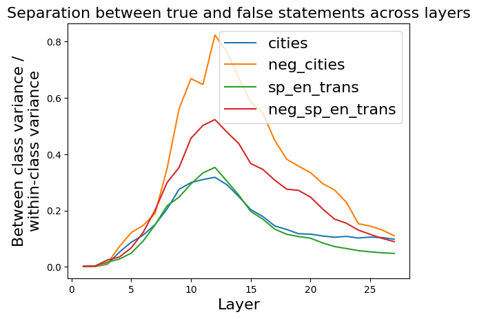
The image is a line chart that displays the separation between true and false statements across different layers of a model or system. The y-axis represents the ratio of "Between class variance / within-class variance," and the x-axis represents the "Layer" number. There are four data series, each representing a different condition or category: "cities," "neg_cities," "sp_en_trans," and "neg_sp_en_trans." The chart illustrates how well the model distinguishes between true and false statements for each category as the layer number increases.
### Components/Axes
* **Title:** Separation between true and false statements across layers
* **X-axis:**
* Label: Layer
* Scale: 0 to 25, with tick marks at intervals of 5.
* **Y-axis:**
* Label: Between class variance / within-class variance
* Scale: 0.0 to 0.8, with tick marks at intervals of 0.2.
* **Legend:** Located in the top-right corner of the chart.
* cities (Teal)
* neg\_cities (Orange)
* sp\_en\_trans (Green)
* neg\_sp\_en\_trans (Brown)
### Detailed Analysis
* **cities (Teal):** The line starts near 0 at layer 0, increases to a peak around 0.32 at layer 12, and then gradually decreases to approximately 0.1 at layer 27.
* Layer 0: ~0.0
* Layer 5: ~0.1
* Layer 10: ~0.28
* Layer 12 (Peak): ~0.32
* Layer 15: ~0.2
* Layer 20: ~0.14
* Layer 25: ~0.1
* Layer 27: ~0.1
* **neg\_cities (Orange):** The line starts near 0 at layer 0, increases sharply to a peak around 0.83 at layer 12, and then decreases to approximately 0.12 at layer 27.
* Layer 0: ~0.0
* Layer 5: ~0.15
* Layer 10: ~0.6
* Layer 12 (Peak): ~0.83
* Layer 15: ~0.65
* Layer 20: ~0.3
* Layer 25: ~0.15
* Layer 27: ~0.12
* **sp\_en\_trans (Green):** The line starts near 0 at layer 0, increases to a peak around 0.36 at layer 12, and then gradually decreases to approximately 0.05 at layer 27.
* Layer 0: ~0.0
* Layer 5: ~0.08
* Layer 10: ~0.25
* Layer 12 (Peak): ~0.36
* Layer 15: ~0.2
* Layer 20: ~0.1
* Layer 25: ~0.06
* Layer 27: ~0.05
* **neg\_sp\_en\_trans (Brown):** The line starts near 0 at layer 0, increases to a peak around 0.52 at layer 12, and then decreases to approximately 0.1 at layer 27.
* Layer 0: ~0.0
* Layer 5: ~0.05
* Layer 10: ~0.4
* Layer 12 (Peak): ~0.52
* Layer 15: ~0.38
* Layer 20: ~0.25
* Layer 25: ~0.12
* Layer 27: ~0.1
### Key Observations
* All four data series start near 0 at layer 0.
* All four data series peak around layer 12.
* "neg\_cities" (Orange) has the highest peak value, indicating the greatest separation between true and false statements for this category.
* "sp\_en\_trans" (Green) has the lowest peak value, indicating the least separation between true and false statements for this category.
* All data series decrease after layer 12, indicating that the separation between true and false statements diminishes in later layers.
* The "neg_cities" series shows a much more pronounced peak and decline compared to the other series.
### Interpretation
The chart suggests that the model is most effective at distinguishing between true and false statements around layer 12. The "neg\_cities" category shows the clearest separation, indicating that the model can most easily differentiate between true and false statements in this category. The decreasing trend after layer 12 implies that the later layers may not contribute as much to the separation of true and false statements, or that the information becomes more diffused or complex. The differences in peak values and rates of decline among the categories suggest that the model's performance varies depending on the specific type of statement being evaluated. The model appears to learn to differentiate between true and false statements up to layer 12, after which its ability to separate these statements diminishes.