\n
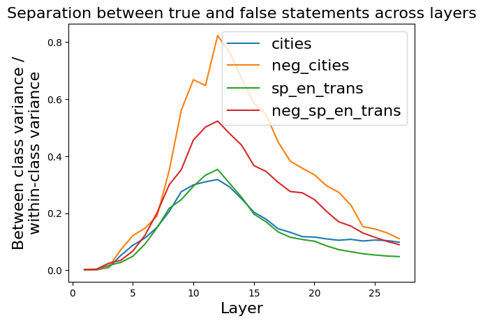
## Line Chart: Separation between true and false statements across layers
### Overview
The image presents a line chart illustrating the separation between true and false statements across different layers. The chart displays four data series, each representing a different condition or dataset, plotted against the layer number. The y-axis represents the "Between class variance / within-class variance", a metric indicating the degree of separation between classes.
### Components/Axes
* **Title:** "Separation between true and false statements across layers" (top-center)
* **X-axis:** "Layer" (bottom-center), ranging from 0 to approximately 27.
* **Y-axis:** "Between class variance / within-class variance" (left-center), ranging from 0.0 to 0.8.
* **Legend:** Located in the top-right corner, containing the following labels and corresponding colors:
* "cities" - Blue
* "neg\_cities" - Orange
* "sp\_en\_trans" - Green
* "neg\_sp\_en\_trans" - Red
### Detailed Analysis
The chart shows the variance ratio for each condition as it changes across layers.
* **cities (Blue Line):** The blue line starts at approximately 0.0 at layer 0, increases gradually to a peak of around 0.28 at layer 12, and then declines to approximately 0.15 at layer 27. The trend is initially upward, reaching a maximum, and then decreasing.
* **neg\_cities (Orange Line):** The orange line begins at approximately 0.0 at layer 0, rises sharply to a peak of around 0.8 at layer 10, and then decreases to approximately 0.2 at layer 27. This line exhibits a strong initial increase followed by a substantial decline.
* **sp\_en\_trans (Green Line):** The green line starts at approximately 0.0 at layer 0, increases steadily to a peak of around 0.25 at layer 12, and then decreases to approximately 0.1 at layer 27. The trend is similar to the blue line, but with a lower overall magnitude.
* **neg\_sp\_en\_trans (Red Line):** The red line starts at approximately 0.0 at layer 0, increases to a peak of around 0.45 at layer 10, and then decreases to approximately 0.1 at layer 27. This line shows a moderate increase followed by a decline, remaining below the orange line throughout.
### Key Observations
* The "neg\_cities" (orange) line consistently exhibits the highest variance ratio, indicating the strongest separation between classes.
* The "cities" (blue) and "sp\_en\_trans" (green) lines show similar trends, with lower variance ratios compared to the "neg\_cities" line.
* All four lines reach their peak variance ratios between layers 10 and 12, after which they all decline.
* The "neg\_sp\_en\_trans" (red) line consistently falls between the "cities" and "neg\_cities" lines.
### Interpretation
The chart suggests that negating the input (as seen in "neg\_cities" and "neg\_sp\_en\_trans") leads to a greater separation between true and false statements, particularly in the earlier layers (up to layer 10). This could indicate that the model is more sensitive to the presence or absence of information when processing negated statements. The peak in separation around layers 10-12 might represent a critical point in the model's processing where the distinction between true and false statements becomes most pronounced. The subsequent decline in separation could be due to the model's ability to integrate information across layers, potentially reducing the initial strong separation. The consistent difference between the negated and non-negated conditions suggests a fundamental aspect of how the model processes information. The data implies that the model learns to differentiate between statements and their negations as it progresses through the layers, but this differentiation diminishes as the model deepens.