## Line Chart: Separation between true and false statements across layers
### Overview
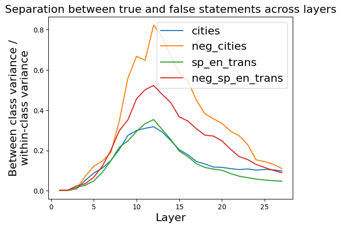
This image is a line chart that visualizes a metric called "Between class variance / within-class variance" across different layers (likely of a neural network or similar model). The chart compares this metric for four distinct datasets or conditions, showing how the separation between true and false statements evolves through the model's layers.
### Components/Axes
* **Title:** "Separation between true and false statements across layers"
* **X-Axis:**
* **Label:** "Layer"
* **Scale:** Linear, ranging from 0 to approximately 27.
* **Major Tick Marks:** 0, 5, 10, 15, 20, 25.
* **Y-Axis:**
* **Label:** "Between class variance / within-class variance"
* **Scale:** Linear, ranging from 0.0 to 0.8.
* **Major Tick Marks:** 0.0, 0.2, 0.4, 0.6, 0.8.
* **Legend:** Located in the top-right corner of the plot area. It contains four entries, each with a colored line sample and a text label:
1. **Blue line:** `cities`
2. **Orange line:** `neg_cities`
3. **Green line:** `sp_en_trans`
4. **Red line:** `neg_sp_en_trans`
### Detailed Analysis
The chart plots four data series, each representing a different condition. The general trend for all series is an initial increase in the variance ratio, reaching a peak in the middle layers, followed by a decline in later layers.
**1. Data Series: `cities` (Blue Line)**
* **Trend:** Starts near 0, rises steadily to a peak, then declines gradually.
* **Key Data Points (Approximate):**
* Layer 0: ~0.0
* Layer 5: ~0.1
* **Peak at Layer 11:** ~0.32
* Layer 15: ~0.20
* Layer 20: ~0.11
* Layer 25: ~0.10
**2. Data Series: `neg_cities` (Orange Line)**
* **Trend:** Shows the most dramatic rise and the highest peak. It increases sharply after layer 5, peaks, and then decreases, remaining the highest series throughout.
* **Key Data Points (Approximate):**
* Layer 0: ~0.0
* Layer 5: ~0.15
* **Peak at Layer 12:** ~0.82
* Layer 15: ~0.55
* Layer 20: ~0.30
* Layer 25: ~0.12
**3. Data Series: `sp_en_trans` (Green Line)**
* **Trend:** Follows a similar shape to `cities` but with a slightly higher peak and a steeper decline in later layers.
* **Key Data Points (Approximate):**
* Layer 0: ~0.0
* Layer 5: ~0.08
* **Peak at Layer 12:** ~0.35
* Layer 15: ~0.20
* Layer 20: ~0.08
* Layer 25: ~0.05
**4. Data Series: `neg_sp_en_trans` (Red Line)**
* **Trend:** Rises to a peak that is lower than `neg_cities` but higher than the other two series, then declines.
* **Key Data Points (Approximate):**
* Layer 0: ~0.0
* Layer 5: ~0.12
* **Peak at Layer 12:** ~0.52
* Layer 15: ~0.36
* Layer 20: ~0.20
* Layer 25: ~0.09
### Key Observations
1. **Peak Layer:** All four series achieve their maximum separation value between layers 11 and 12.
2. **Magnitude Hierarchy:** The `neg_cities` condition consistently shows the highest separation metric, peaking at approximately 0.82. The order of peak magnitude is: `neg_cities` > `neg_sp_en_trans` > `sp_en_trans` > `cities`.
3. **"Neg" Effect:** For both the "cities" and "sp_en_trans" datasets, the "neg" (likely negated or false) version (`neg_cities`, `neg_sp_en_trans`) exhibits a significantly higher peak separation than its non-negated counterpart.
4. **Convergence:** By the final layers (25+), the separation values for all series converge to a low range between approximately 0.05 and 0.12.
5. **Initial State:** All series begin at or very near 0.0 at layer 0, indicating no separation at the input or first layer.
### Interpretation
This chart likely analyzes how a model's internal representations distinguish between true and false statements as data propagates through its layers. The "Between class variance / within-class variance" metric is a measure of class separability; a higher value indicates that representations for true and false statements are more distinct from each other relative to their internal consistency.
* **What the data suggests:** The model develops its strongest ability to separate true from false statements in its middle layers (around layer 12). This separability then diminishes in deeper layers, possibly as the model integrates information into more abstract, task-specific representations where the true/false distinction is less explicitly encoded.
* **How elements relate:** The consistent peaking layer suggests a common architectural or processing stage where this distinction is maximally emphasized. The large gap between the "neg" and non-"neg" lines implies that the model finds it easier to separate negated/false statements from true ones than to separate the base categories themselves. This could be because negation introduces a strong, consistent signal that contrasts sharply with affirmative statements.
* **Notable patterns/anomalies:** The most striking pattern is the dominance of the `neg_cities` line. This could indicate that the "cities" dataset, when negated, provides the clearest or most learnable contrast for the model. The near-zero starting point confirms that this separability is learned and developed through the network's transformations, not inherent in the input data. The convergence at the end suggests that the final layers may be optimizing for a different objective that does not rely on maintaining this explicit variance ratio.