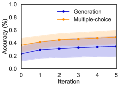
## Chart Type: Line Chart of Accuracy vs. Iteration for Generation and Multiple-choice Tasks
### Overview
This image displays a 2D line chart illustrating the change in "Accuracy (%)" over "Iteration" for two distinct methods or tasks: "Generation" and "Multiple-choice". Each method is represented by a line with markers and an associated shaded area, likely indicating a confidence interval or standard deviation. The chart shows that both methods improve in accuracy with more iterations, but "Multiple-choice" consistently achieves higher accuracy than "Generation".
### Components/Axes
The chart is structured with a horizontal X-axis at the bottom and a vertical Y-axis on the left.
* **X-axis (Horizontal)**:
* **Label**: "Iteration"
* **Range**: From 0 to 5.
* **Major Ticks**: Labeled at 0, 1, 2, 3, 4, 5.
* **Y-axis (Vertical)**:
* **Label**: "Accuracy (%)"
* **Range**: From 0.0 to 1.0.
* **Major Ticks**: Labeled at 0.0, 0.2, 0.4, 0.6, 0.8, 1.0.
* **Legend**: Located in the top-right portion of the plot area.
* A blue line with a solid circular marker represents "Generation".
* An orange line with a solid circular marker represents "Multiple-choice".
### Detailed Analysis
The chart presents two data series, each showing accuracy as a function of iteration, along with a shaded region representing variability.
1. **Generation Series (Blue Line with Blue Circular Markers)**:
* **Trend**: The "Generation" accuracy starts lower and generally increases with each iteration, showing a steeper rise initially and then leveling off.
* **Data Points (Approximate)**:
* Iteration 0: Approximately 0.24 Accuracy (%). The shaded region extends from about 0.15 to 0.35.
* Iteration 1: Approximately 0.29 Accuracy (%).
* Iteration 2: Approximately 0.31 Accuracy (%).
* Iteration 3: Approximately 0.33 Accuracy (%).
* Iteration 4: Approximately 0.34 Accuracy (%).
* Iteration 5: Approximately 0.35 Accuracy (%). The shaded region extends from about 0.25 to 0.45.
* **Shaded Area**: A light blue shaded region surrounds the blue line, indicating the range of variability (e.g., standard deviation or confidence interval) for the "Generation" accuracy at each iteration.
2. **Multiple-choice Series (Orange Line with Orange Circular Markers)**:
* **Trend**: The "Multiple-choice" accuracy starts higher than "Generation" and also increases with iterations, following a similar pattern of initial rapid growth followed by a plateau. It consistently maintains a higher accuracy than "Generation".
* **Data Points (Approximate)**:
* Iteration 0: Approximately 0.37 Accuracy (%). The shaded region extends from about 0.35 to 0.50.
* Iteration 1: Approximately 0.41 Accuracy (%).
* Iteration 2: Approximately 0.44 Accuracy (%).
* Iteration 3: Approximately 0.46 Accuracy (%).
* Iteration 4: Approximately 0.48 Accuracy (%).
* Iteration 5: Approximately 0.49 Accuracy (%). The shaded region extends from about 0.40 to 0.55.
* **Shaded Area**: A light orange shaded region surrounds the orange line, indicating the range of variability for the "Multiple-choice" accuracy at each iteration.
### Key Observations
* **Performance Difference**: The "Multiple-choice" method consistently outperforms the "Generation" method across all iterations, with a noticeable gap in accuracy.
* **Improvement Over Iterations**: Both methods show an increase in accuracy as the number of iterations grows from 0 to 5.
* **Diminishing Returns**: The rate of accuracy improvement appears to slow down after the first few iterations for both methods, suggesting that performance is approaching a plateau or convergence point within this range of iterations.
* **Variability**: The shaded regions indicate that there is some variability in the accuracy measurements for both methods, but the mean lines remain distinct. There is minimal overlap between the upper bound of the "Generation" shaded area and the lower bound of the "Multiple-choice" shaded area, particularly at higher iterations, reinforcing the consistent performance difference.
### Interpretation
This chart suggests that the "Multiple-choice" task or evaluation method is inherently easier or more effectively handled by the underlying system than the "Generation" task. The consistent performance gap, even when considering the variability shown by the shaded regions, indicates a robust difference between the two.
The upward trend for both lines signifies that the system or model benefits from iterative processing or training, leading to improved accuracy. However, the flattening of the curves towards Iteration 5 implies that the system's learning or refinement process for these tasks might be reaching its limits within the current setup or that further iterations would yield only marginal gains.
From a Peircean investigative perspective, this data could prompt further questions:
1. **Why is "Multiple-choice" consistently better?** Is it due to the nature of the task (e.g., recognition vs. creation), the evaluation metric, or the model's architecture being more suited for discriminative tasks?
2. **What happens beyond 5 iterations?** Would the curves fully converge, or would the gap remain constant?
3. **What do the shaded regions represent?** Understanding if they are standard deviations, confidence intervals, or interquartile ranges would provide deeper insight into the reliability and stability of these accuracy measurements.
4. **What specific "Generation" and "Multiple-choice" tasks are being compared?** Contextualizing the tasks would help understand the implications of these accuracy levels. For instance, an accuracy of ~0.35 for "Generation" might be considered poor for some applications but impressive for others, depending on complexity.
Overall, the chart clearly demonstrates a differential performance between two task types, both showing learning over iterations but with "Multiple-choice" maintaining a significant advantage.